Animal Crossing: New Horizons Redesign Case Study
UI/UX Design
About the Project
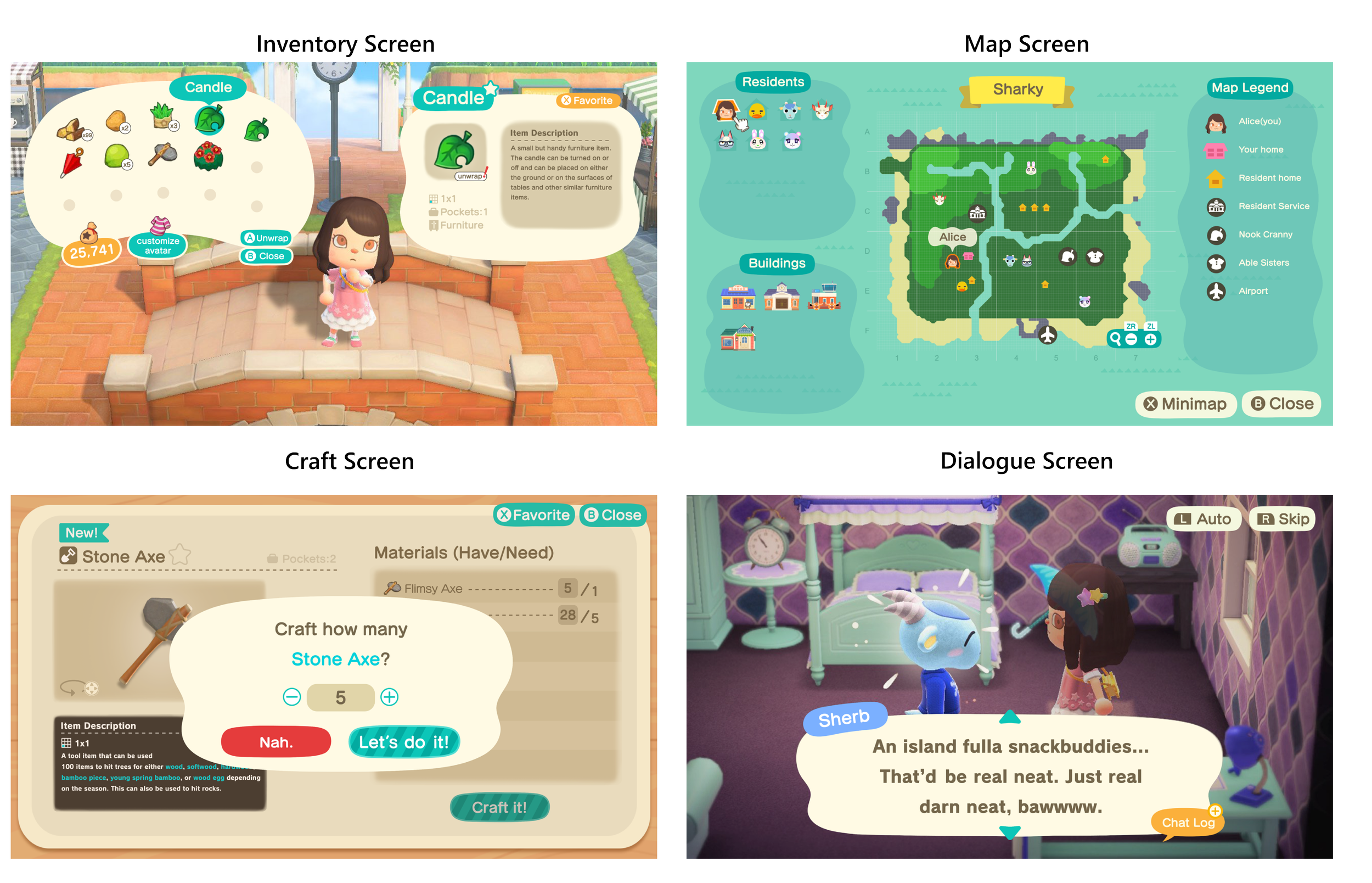
As part of a UI/UX for Video Game course by ELVTR, I had the opportunity to study and research a portion of Animal Crossing: New Horizons’ design. Diving further into some of the gameplay, I was able to redesign some of the interface by using the skills and knowledge taught to us over the course of a few months and applied what I learned into a case study that not only re-imagines but also enhances different aspect of the game’s interface.
My Role
UI/UX Designer
Challenges
Completing a case study on a video game with basic UI/UX design and fundamental experience
Limited timeframe and resources
Conducting user testing and feedback gathering in a short time frame
Length of the project
7 weeks
Tools Used
Design Process
Research
To be able to redesign the interface, I have to first understand the gameplay of the screens that will be focused on, and how players react and the actions they are able to do for each of those screens. Two of the main things that players usually do when they play a game is:
Learn the game
Make decisions based on what the best option is
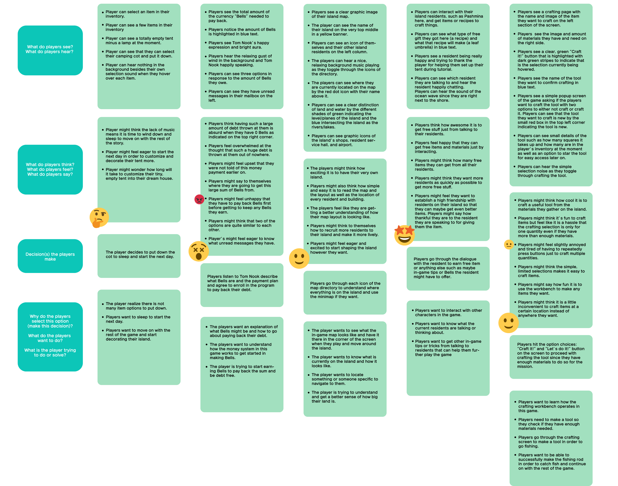
Based on this, I mapped out the Player Journey of what the game developer’s intentions are and to jot notes down based on how the players will react and make decisions.
Player Journey
Paper Prototype
Developing these quick paper prototypes was important to view all the interactions and layouts before moving on to the wireframes. This easy, hands-on approach allowed for rapid iterations while focusing on usability and the overall user flow. The paper prototype made it easy to simulate how the gameplays for some of the screens would look like, which helps in identifying early design improvements while keeping the focus on user experience.
Flowchart
The Flow Chart diagram below was created to map out the user journey within the game experience. It visually outlines the steps the players take through first opening their inventory, navigating around the map, and eventually triggering an objective quest by engaging in a dialogue with an NPC, which results in players needing to completely craft an item before continuing on with the rest of the game. This flow chart is crucial for ensuring that the interfaces offer a logical, intuitive progression for players, helping to identify any potential issues or improvements in the user experience before moving on to the detailed high-fidelity screens.
If you would like to view a higher resolution of the flow chart, click here
Wireframes
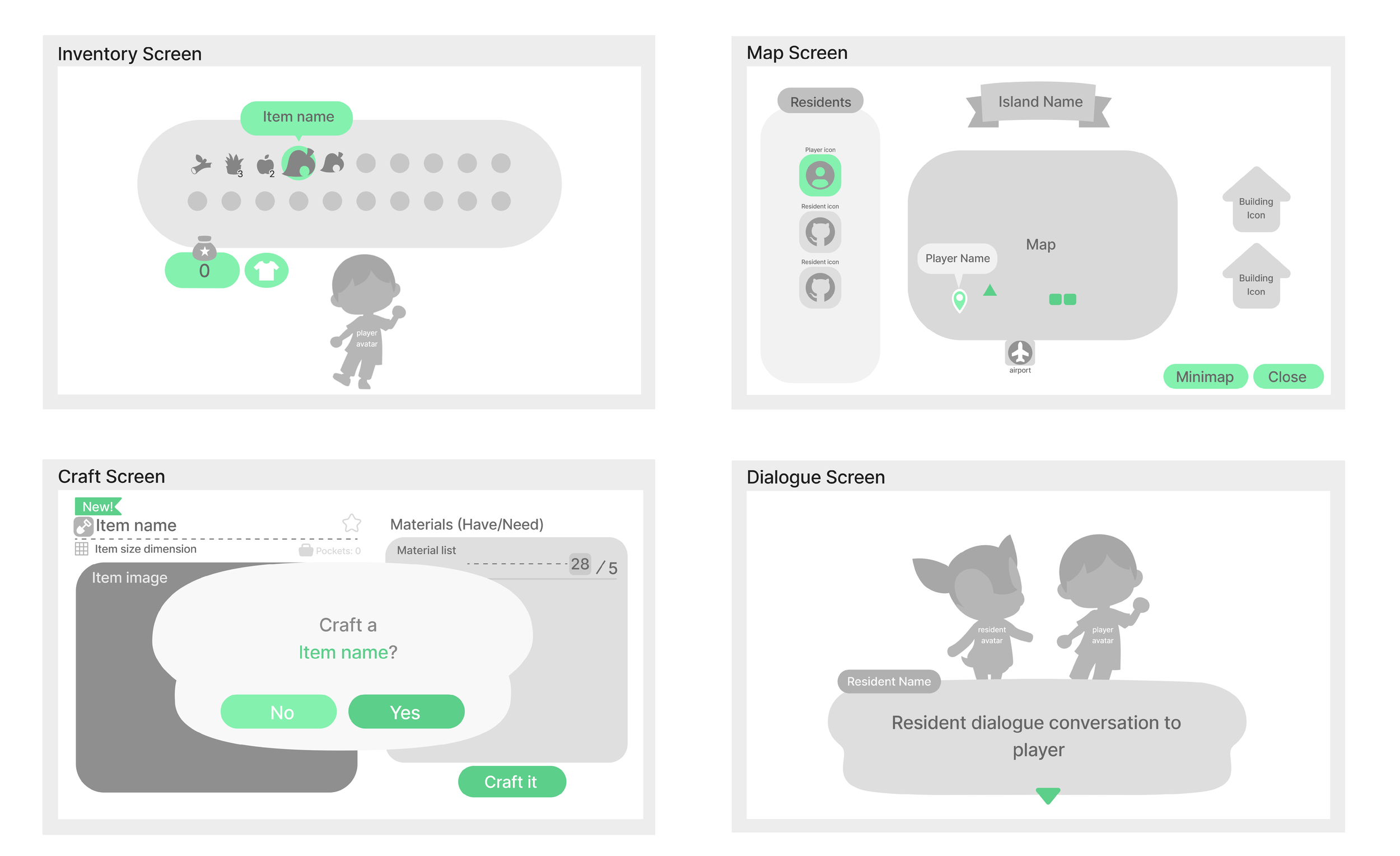
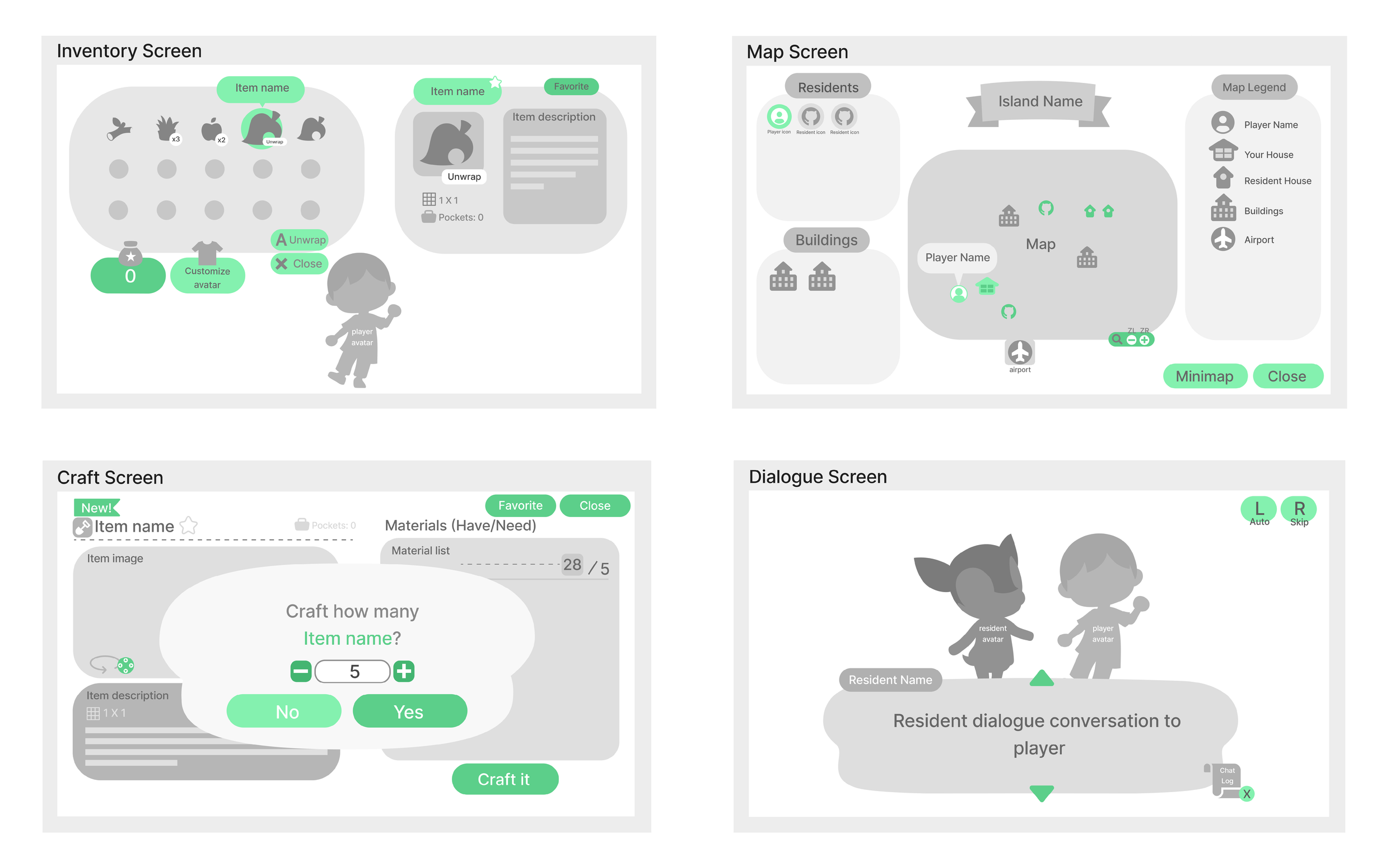
Creating these low-fidelity wireframes helped me establish the basic layout and functionality of these key screens. These four wireframes focused more on the structure rather than the visual details, allowing for quick iteration and usability testing in the next step.
Research Objectives
The goal for this test is to see how clear and readable each wireframe is and if the players can successfully understand how to navigate all of the wireframe screens.
Some things to keep in mind of:
Are players able to perform each tasks on all 4 wireframe screen without any assistance? If not, then why?
Do the players feel as though all 4 screens are easy to read and simple enough to understand?
Are there any options that players cannot do but wish they can do on each screen?
Conduct revisions to each wireframe based on the test results and feedbacks given from each testing participant.
Research Logistics
Recruitment:
Target audience consists of 3 casual to hardcore gamers
Genders and age: Between 20-30 years old, both male and female
Very familiar with gaming platforms ranging from PC to consoles
Platform:
Figma Wireframes
Task Design:
All three players will go through the 4 wireframes and talk about their thoughts regarding the tasks they are given and if they can successfully complete the tasks as well as any confusing element they come across.
Schedule:
Monday night starting around 8:30PM
Individual calls
Usability Task Questions
Inventory Screen
1. You just need to see your inventory really quick and want to continue on exploring the island. Where on the screen can you expect to close the inventory?
2. You just picked up a new item off the ground and want to know what it does or what it can be used for, how would you go about reading the description of the new item you acquired?
3. Pretend you want to access a specific item in your inventory. Could you walk me through how you would expect to do this using this wireframe?
Map Screen
1. Looking at this map, you want to head to the clothing store building to buy clothes to wear, describe how you would go about finding the location of the specific store?
2. Imagine you need to go visit your friend on their island and need to head to the airport, what elements or icons can you use to show your orientation and location in order to head to the airport?
3. You need to go find one of your resident to talk to them, but your island is big and you don’t know where they are located. Use the map screen to find out the location of your residents’.
Craft Screen
1. You decided you want to craft an item. How would you confirm your choice and proceed further on? Can you show what options are available and how to complete the crafting process?
2. You want to craft this item but you don’t know what it actually does. Can you show on the screen how to view the item details and description?
3. Let’s say you have 30 of the materials and you want to make 5 of the same item instead of 1. Can you craft 5 of the same item using this screen?
Dialogue Screen
1. You have 5 other residents currently residing on the island with you. Can you identify which one of those resident is having a conversation with you at the moment?
2. Pretend you are having a conversation with one of the residents on your island and you just finished reading the current dialogue box, can you show me how to continue on to the next dialogue?
3. Imagine you were distracted and didn’t pay attention to what the resident said in the beginning of the dialogue, show me how to view the entire dialogue conversation so far.
Usability Test Script Questions
Inventory Screen
What was your first impression when you saw this inventory screen?
What motivated you to click [outside of the bubble] when asked to [navigate out of the inventory]? And why was that?
Are there any options you expected to see in the inventory screen but couldn’t find it?
Map Screen
What are your thoughts on the layout of this map screen?
What came to mind when you had to [Find your residents’ location on the map]?
Which task did you find the easiest to complete and what was it that made it the easiest?
Craft Screen
What do you think about the layout and information here on the craft screen?
What did you think was difficult to do on this crafting screen?
I saw that you [hovered over the item image section on the left]. Can you tell me more about your thought process?
Dialogue Screen
I noticed that you were trying to [click on the green arrow], what made you want to do that?
What did you thin about the process for [continuing on to the next dialogue]?
Was there anything lacking on the dialogue screen, and can you tell me why you think that?
Usability Testing Results
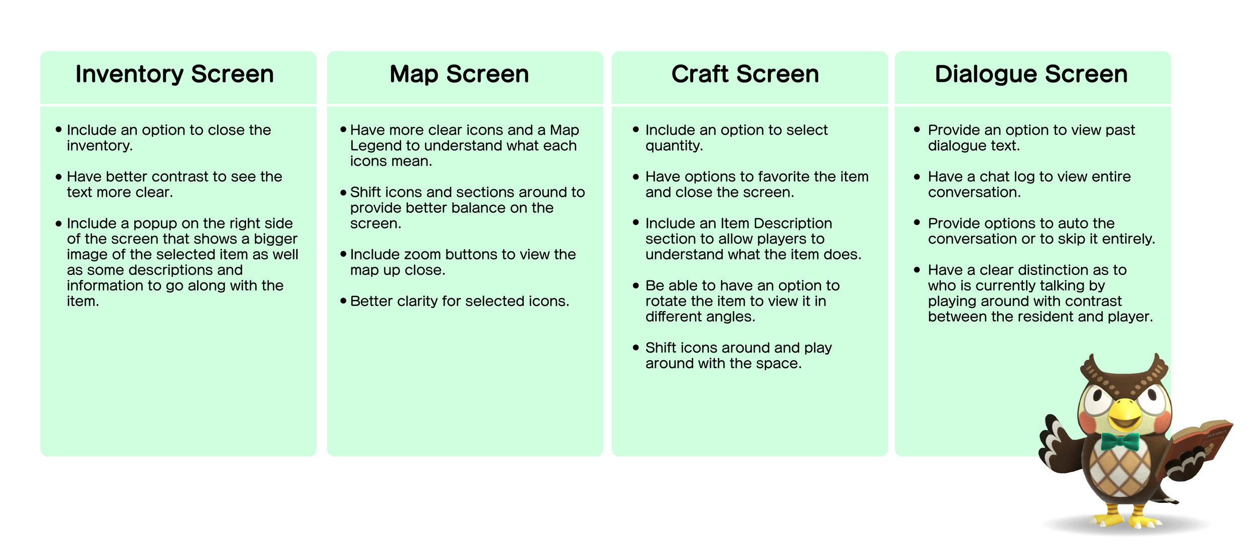
Based on the test results from interviewing 3 players on the 4 different screens, there needs to be a bit more options provided for the players and some clear distinction between some of the icons. Here are some specific steps for each of the screens:
Iterated Wireframes
Based on feedback from the usability testing of the low-fidelity wireframes, I iterated these to address key areas of improvement. Each iteration focused on enhancing user experience by responding to the specific pain points identified during testing, ensuring a more intuitive and accessible interface.
Visual Design Process
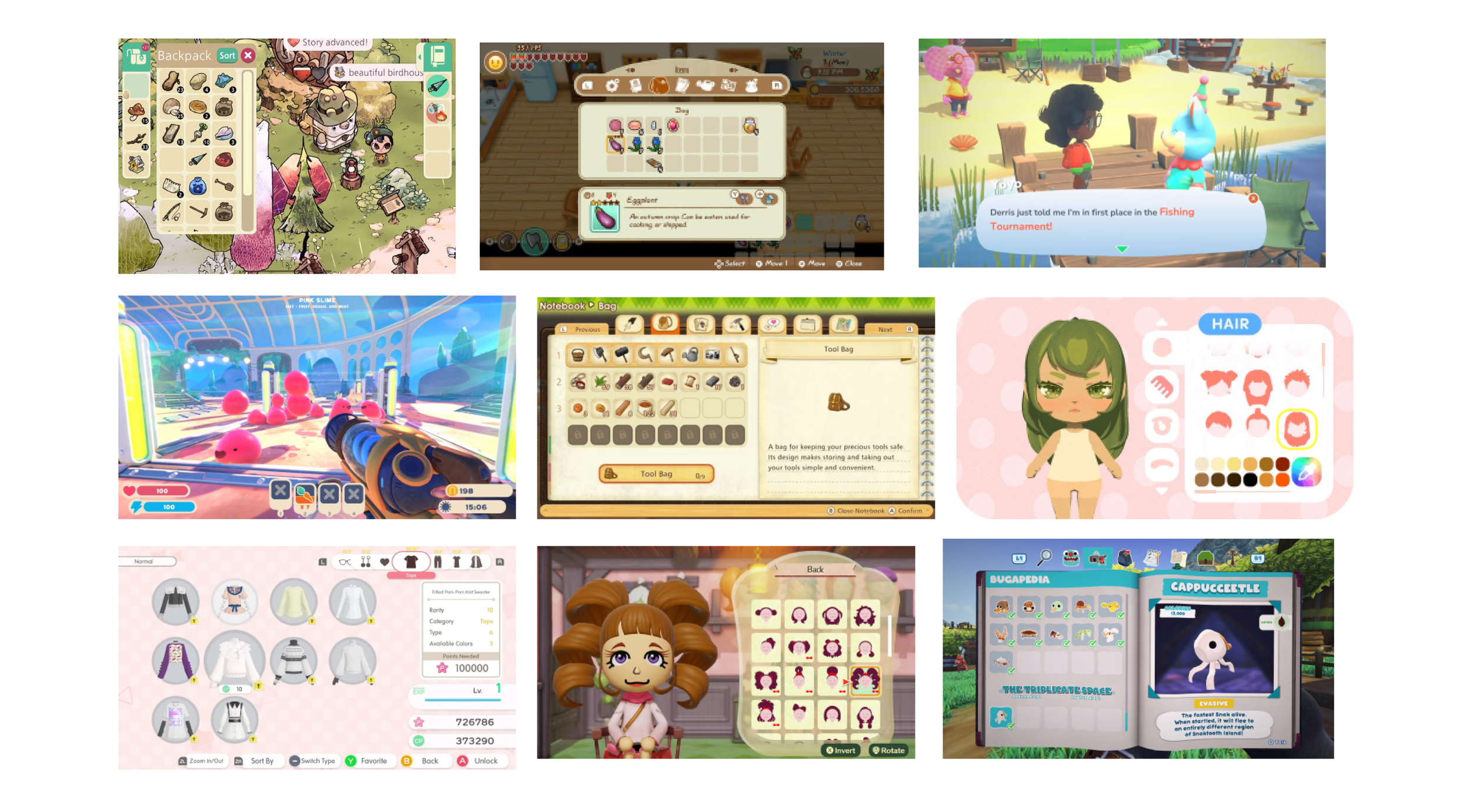
Looking closely at the art and style of Animal Crossing: New Horizons, I wanted to keep the consistency on-theme with how the interface is in the game. The shapes are very simple and rounded, with limited sharp edges as well as minimal to no shading or depth in the interface. I compiled a mood board and UI style guide of similar interfaces as seen in other games that showcases the simple and graphic look of the UI.
UI Mood board
UI Style Guide
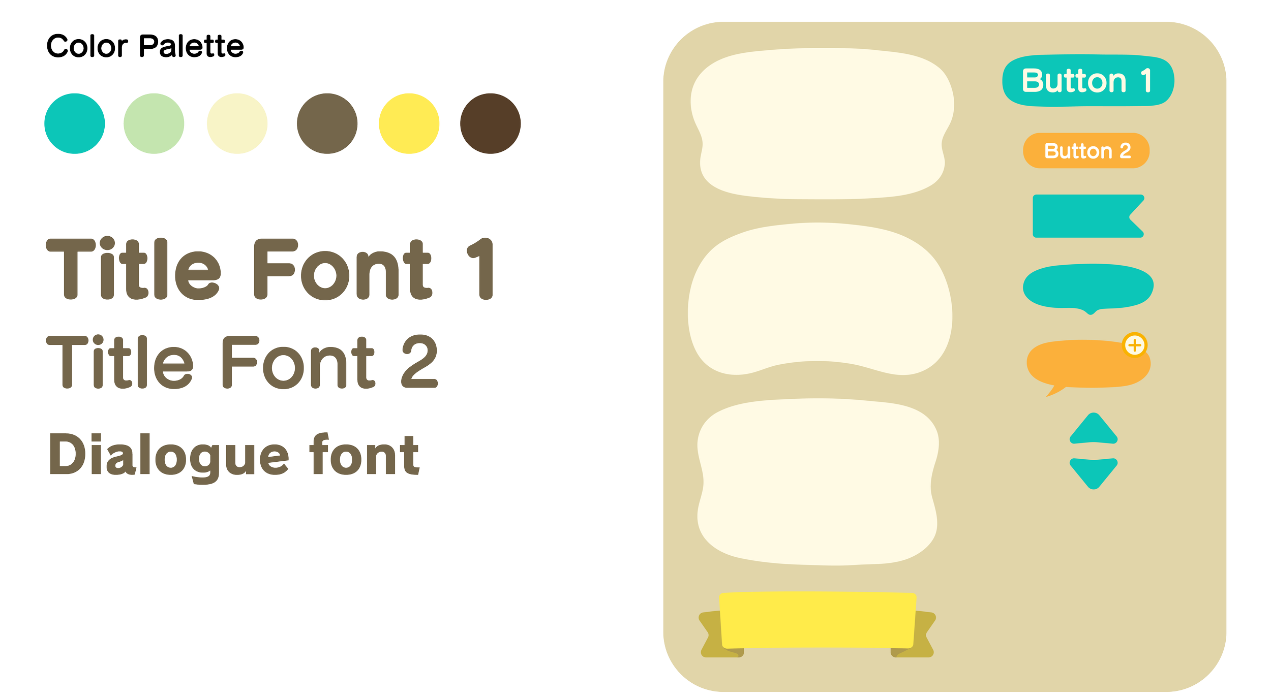
I’ve kept the original color palette, font styles, and UI elements the same when moving onto the high-fidelity wireframes. I wanted to keep everything on brand and consistent throughout the game, with just slight addition and adjustments made to the UI elements.
UI Mockups
For the UI mockups, I focused on redesigning key interface elements to improve accessibility and usability. By adjusting the color contrasts, enhancing icon visibility, and streamlining the user flow, I created a more intuitive and user-friendly experience. The mockups showcase clearer navigation, improved readability of key elements, and subtle visual updates that align with the game’s overall aesthetic, all while still addressing the potential usability issues.
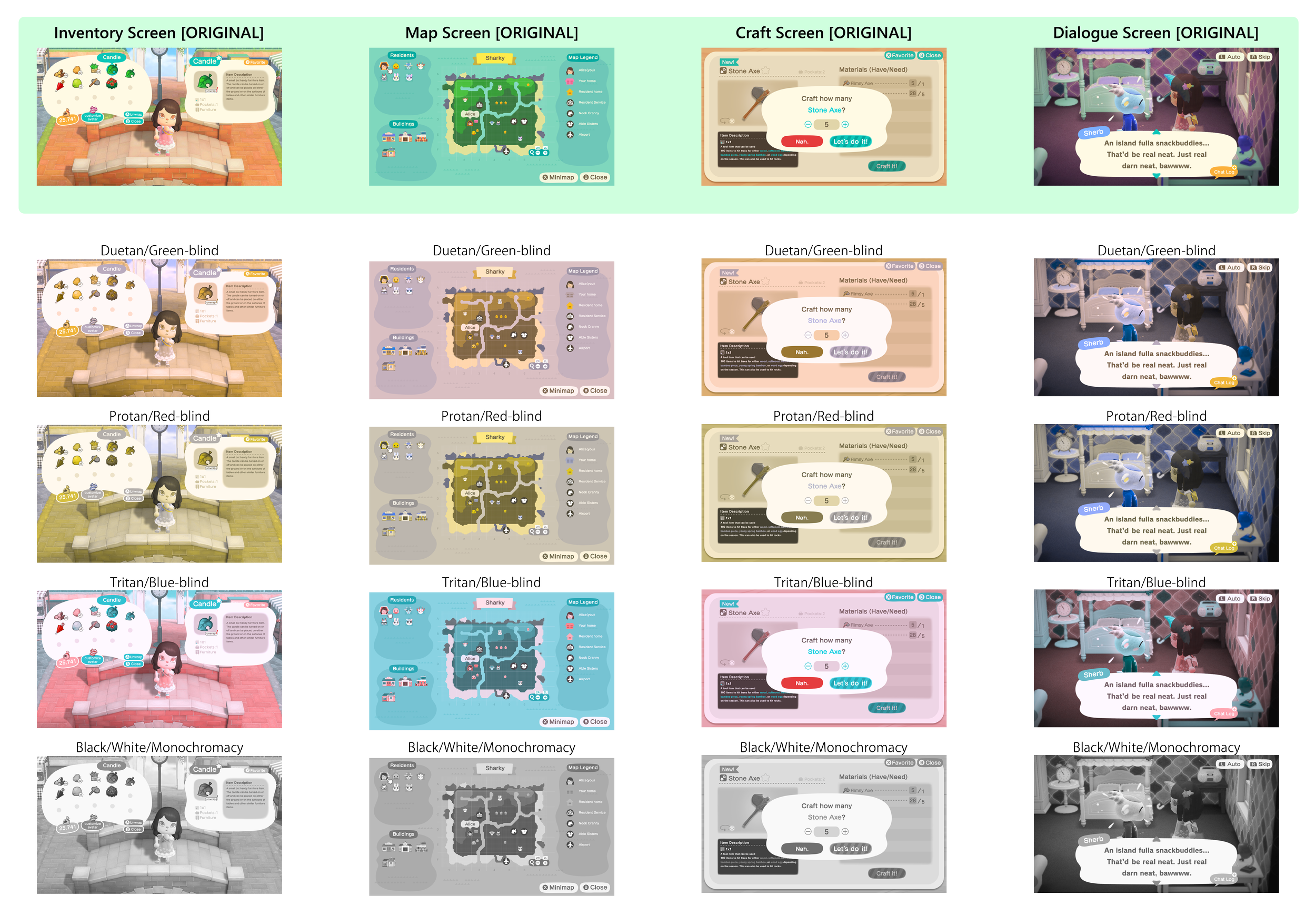
Color Blindness Check
The green leaf item and its hover background on the left side of the screen have similar color values, making it hard to tell when it's selected, especially for users with blue-blindness or monochromacy.
In some colorblind tests, such as green-blind, red-blind, and monochromacy, the “Your home” icon blends with the map legend background, making it hard to see. Other icons with similar green tones also get lost, so adjusting the saturation or contrast could help.
The star symbol and the word “Pockets” on the left side of the screen are difficult to read after color-blind testing and need higher contrast. Similarly, the key item labels under the Item Description box should stand out more.
The up and down arrows on the dialogue box can be hard to distinguish as they blend into the background and aren't as noticeable as the chat log, making them less obvious as selectable options for players.
Iterated UI Mockups
Based on the results from the color blindness check, I revised the screens with subtle revisions to bump up the contrast in order for players with visual impairment to be able to view the screens without any issues.
Inventory Screen Iterations
Changed up the color for the background circle when an item is currently being selected and made sure the color is not a similar tone as the item but brighter and lighter to help give it a highlight effect.
Map Screen Iterations
Adjusted the color of the background as well as lowering the saturation of the map a bit. Bumped up the saturation and tweaking the colors a bit for the icons (mainly the player house and resident house icons) to help make the icons pop up and be more noticeable.
Craft Screen Iterations
Made the star symbol and “Pockets” text slightly darker to help make them more readable against the background. Also changed up the color of the key item words so that they can still be distinguished between the rest of the text for the color-blind versions.
Dialogue Screen Iterations
Changed up the colors of the top and bottom arrows in the dialogue box to match the chat log icon so that they are more noticeable and clear for the color-blind versions.
Conclusion
Working on the case study to redesign some of the interface for Animal Crossing: New Horizons has been an incredibly enjoyable and rewarding experience. This was an excellent new learning opportunity where I was able to apply the new skills I learned and effectively use them in a practical context.
Outcomes:
Learned how to identify areas in the game’s interface to improve and enhance user flow for a smoother and more intuitive game play experience
Being able to explore methods for gathering and incorporating user feedback into the game’s interface and making the design more player centric
Exploring opportunities such as enhancing accessibilities to make the interface more accessible to a broader audience, such as diving into alternative control and color options
