My Youthspan Health And Longevity Case Study
UI/UX Design
Introduction
My Youthspan Health and Longevity Plan, created by MyEdMaster LLC, is designed to provide personalized health insights and recommendations based on user data. With its focus on longevity and wellness, the platform serves a broad audience, from health-conscious individuals to busy professionals. Our design team was brought in to assess the platform’s current user interface and experience, identify areas for improvement, and propose a solution that would increase user engagement and satisfaction, especially for a demographic that may have varying levels of technology proficiency.
My Role
With only a timeframe of 4 weeks, my team and I were tasked to focus on Defining, Designing, and Validating their Longevity Project. As one of the four designers working on this project, my roles were to:
Create Use Personas
Low-Fidelity & High-Fidelity Wireframes
Test Script and Usability Testing
High-Fidelity Prototypes
Providing Feedback
Tools & Programs Used:
Design Process
Objective
For this Industry Design Project with the client, MyEdMaster LLC, our team of 4 designers were tasked with conducting a thorough analysis of the existing UI/UX, identify pain points and areas for enhancement, and create wireframes that propose a more intuitive and engaging user experience. While the client has stated that they are not expecting any actual UI changes at this point in time as their website is set to launch a beta version soon, we were given complete creative freedom in our recommendations to them. Our deliverables will be considered for their future updates, rather than for the initial product launch scheduled to be set live in the first week of September.
Research
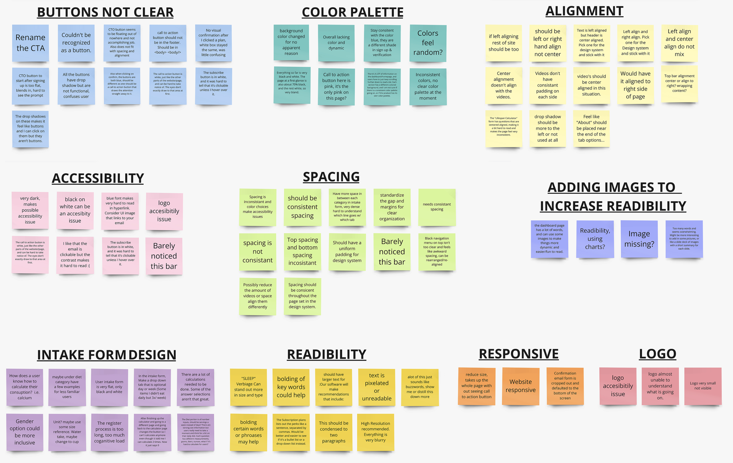
To kick off the project, My Youthspan Health and Longevity Plan, our team was provided with a testing account to conduct an internal usability evaluation of the client’s website. All of us set out to identify key usability and interface issues by going through the site as real users would, focusing on the user flow, accessibility, and how easy it was to navigate from start to finish. During this internal testing phase, we jotted down our findings and sorted out our notes on areas that needed improvement. These insights were then organized into an affinity map.
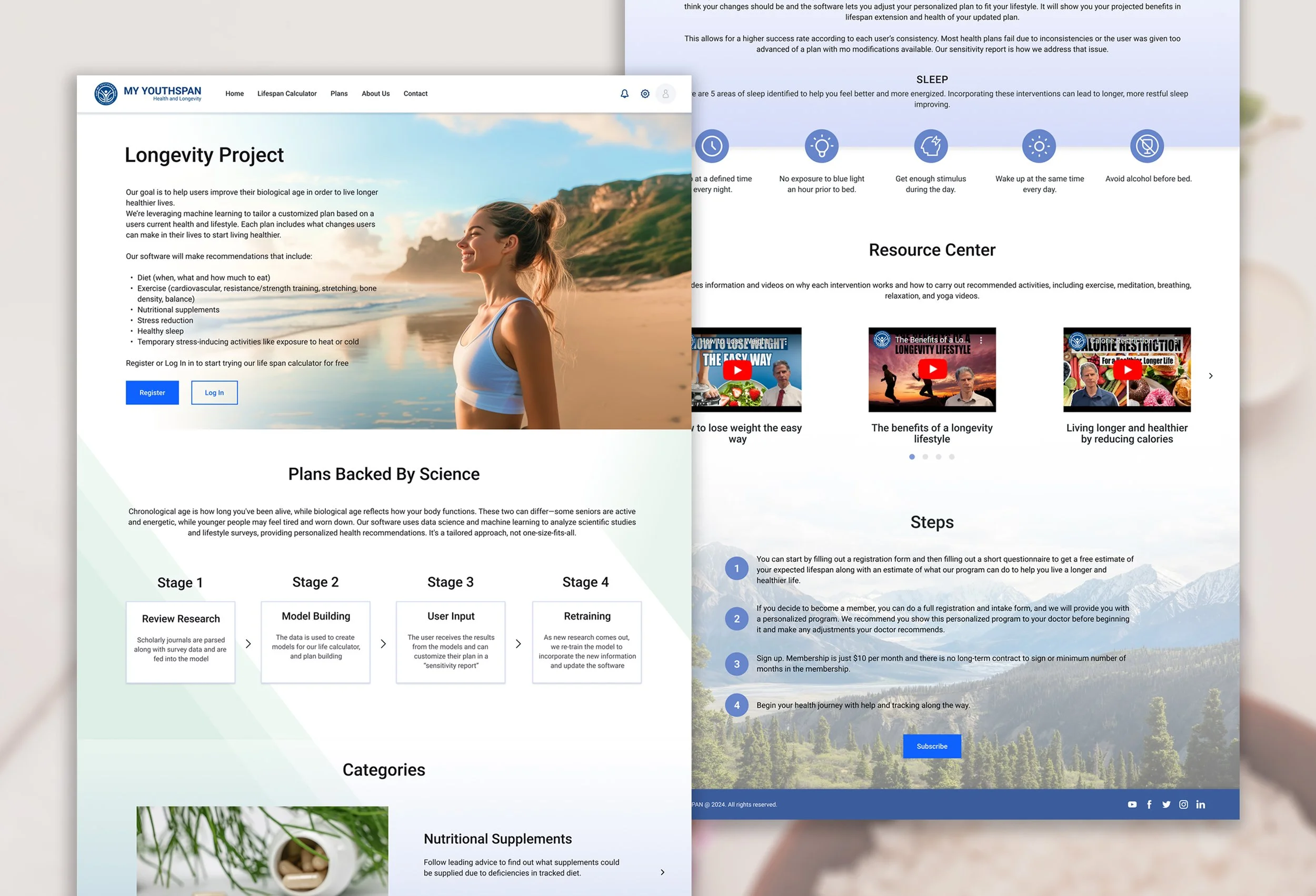
Original Website
My team and I all conducted our own usability testing from start to finish on the client’s website, we jotted down some usability issues and inconsistencies we found and sorted them into common themes and pinpoint the most pressing issues, such as inconsistencies in the design, visual or text clutters, and alignment issues.
Card Sorting
Breaking down the intake form to tackle, as this is the priority screen our client wanted us to focus on first, my team and I decided to conduct card sorting to figure out how other users like to group the questions asked and what common theme names they had in mind when sorting them. This was the result of the common groups and themes:
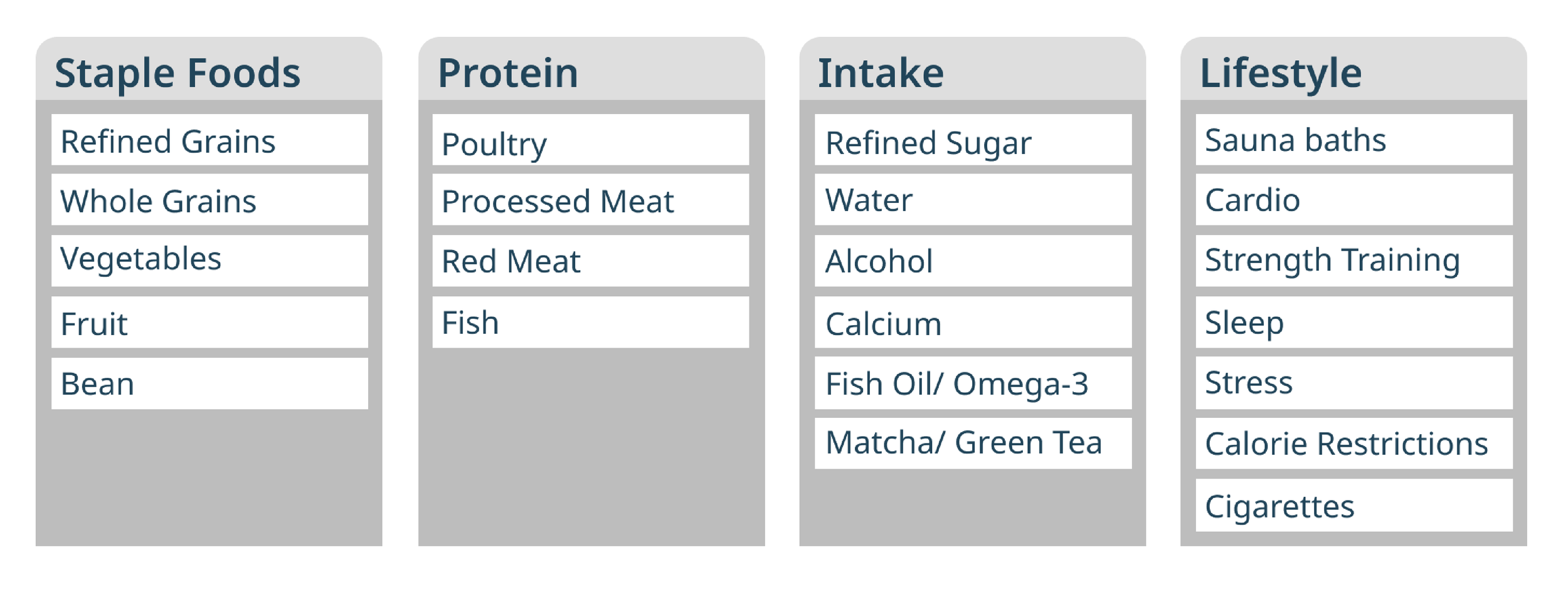
Participants have suggested the top four terms for the groups of questions asked on the intake form:
Staple Foods
Protein
Intake
Lifestyle
User Flow
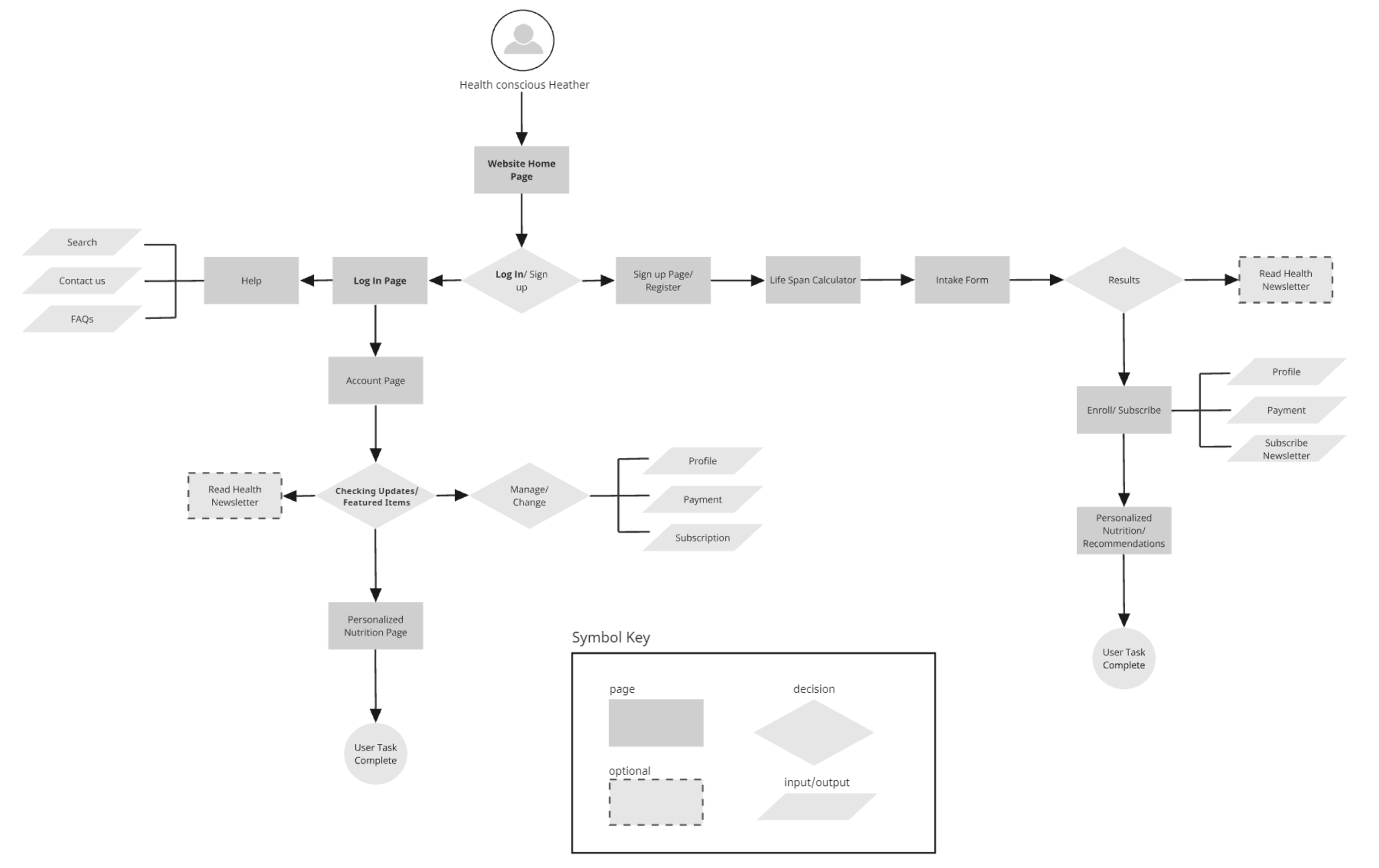
The user flow is designed to seamlessly guide users from onboarding to receiving personalized health insights. New users start with registration, leading to the lifespan calculator, where they complete a form and view results. From there, they can choose to subscribe to a personalized health plan. Returning users can easily navigate the homepage, accessing their account, health plan, or other resources like newsletters.
Personas
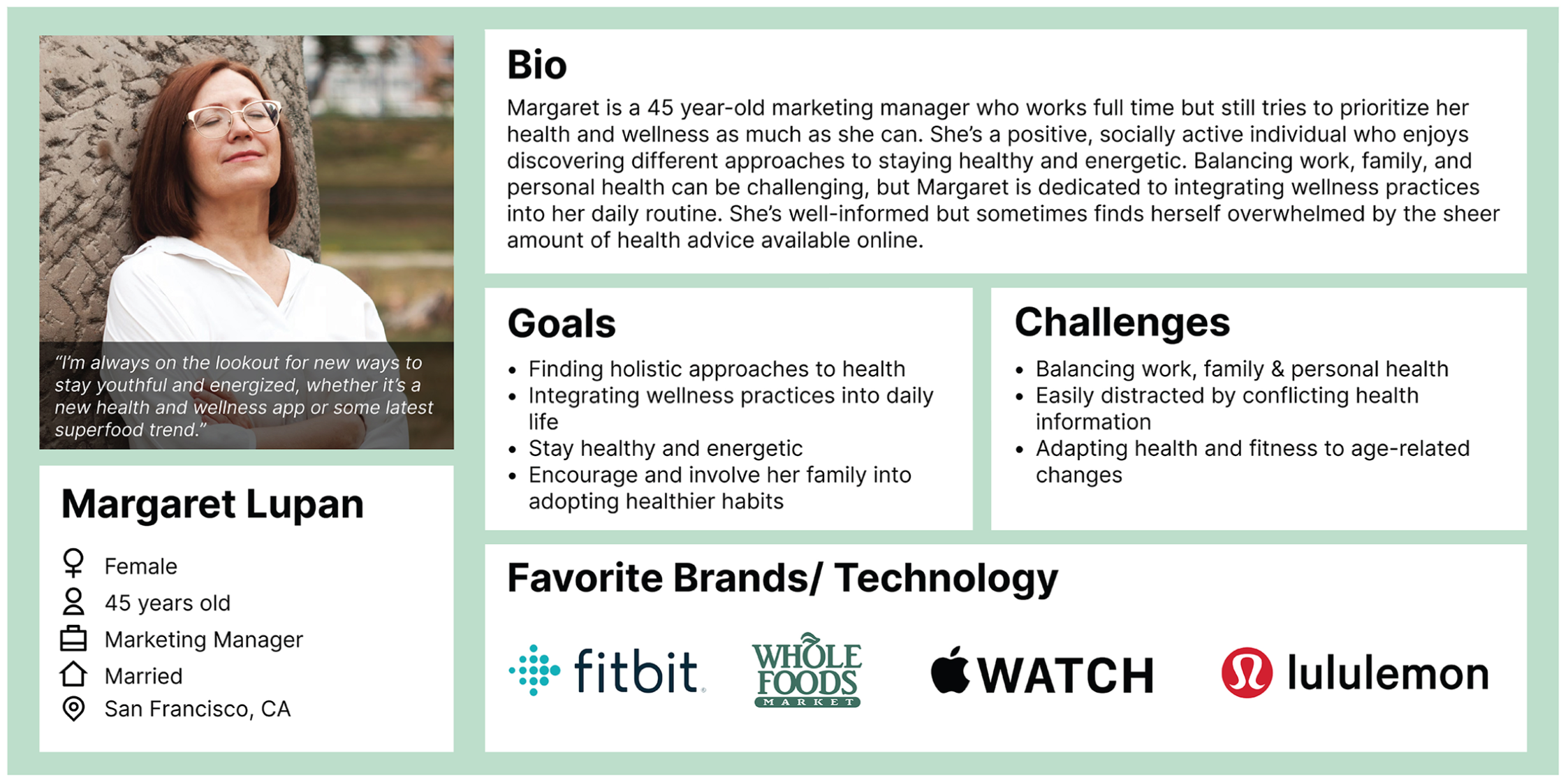
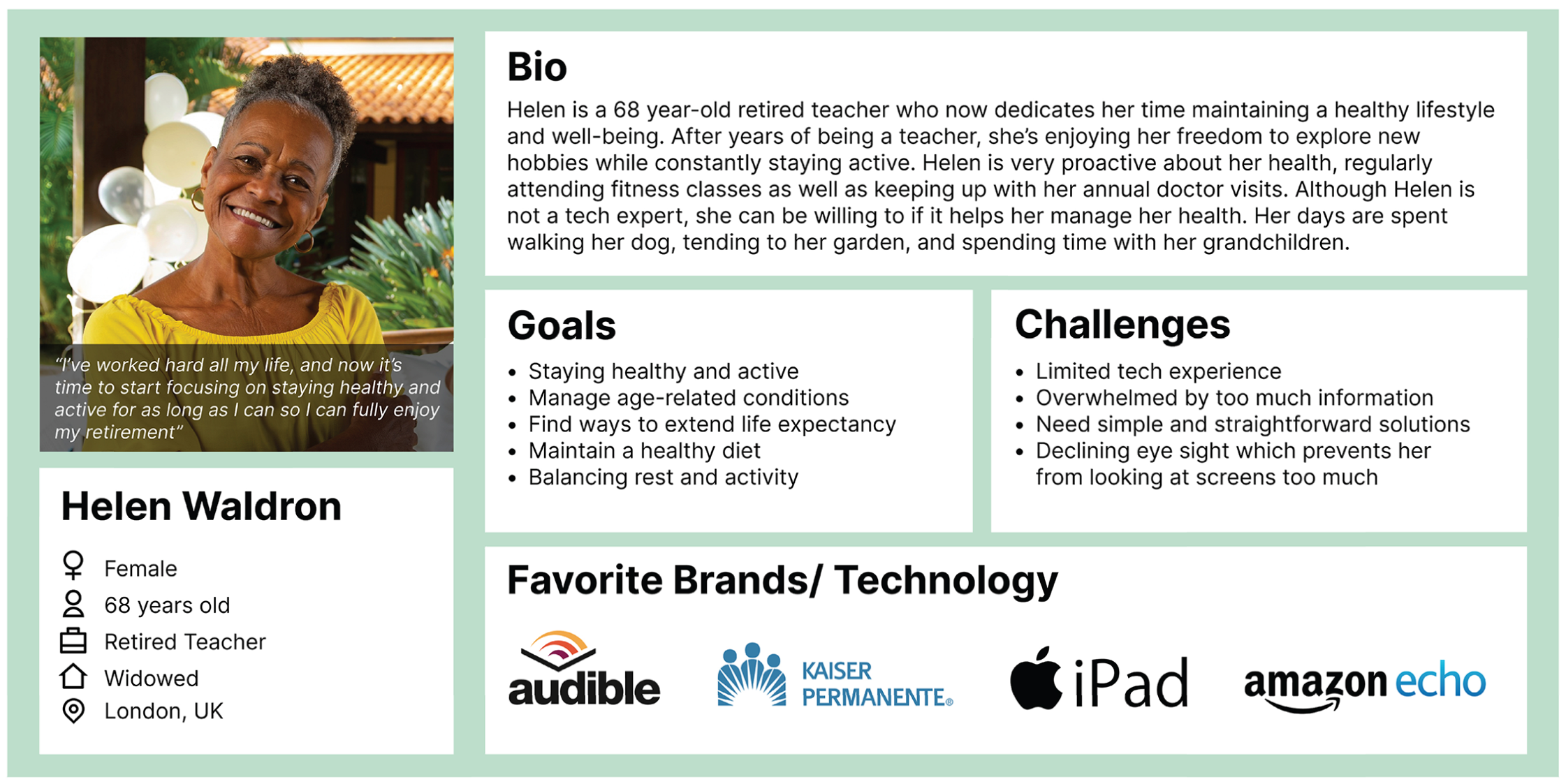
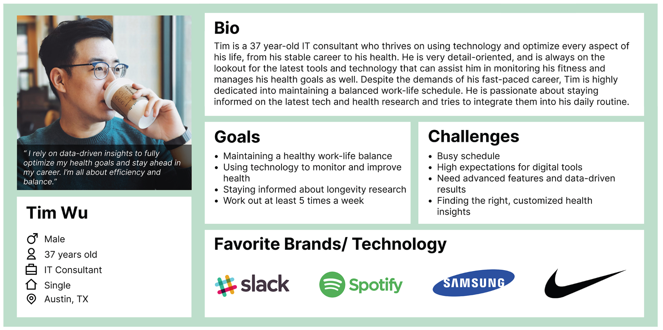
We developed personas to represent the platform's diverse target audience, guiding our design decisions by addressing user needs, behaviors, and challenges. These personas helped us tailor the user experience to align with the expectations of key demographics.
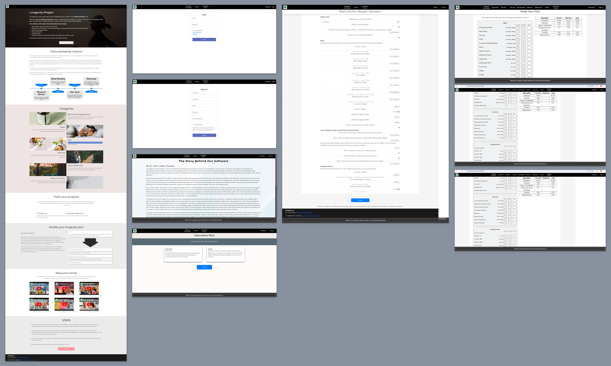
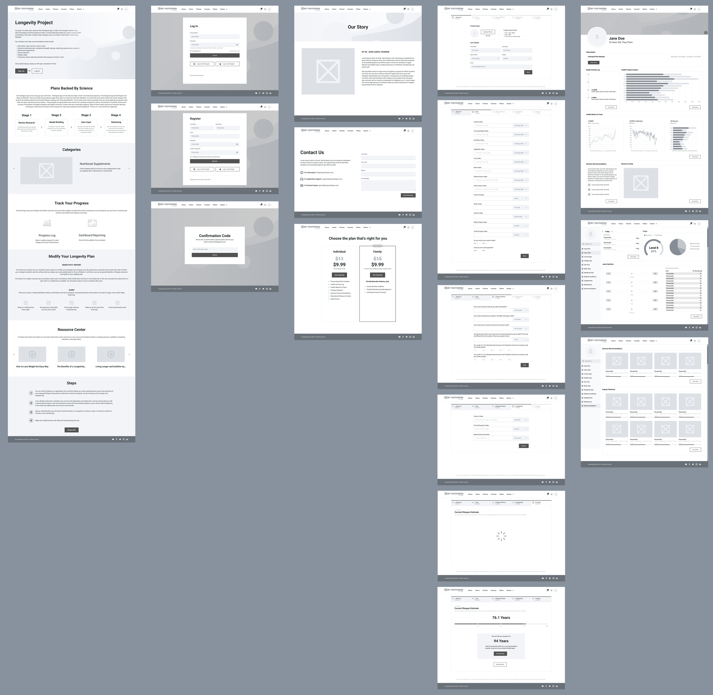
Low-Fidelity Wireframes
In the next phase, we created low-fidelity wireframes for all the existing pages, refining the layout for improved clarity and hierarchy while maintaining elements of the original design. We introduced consistent features across the site to create a cohesive, unified brand experience, which was lacking in the initial client’s version.
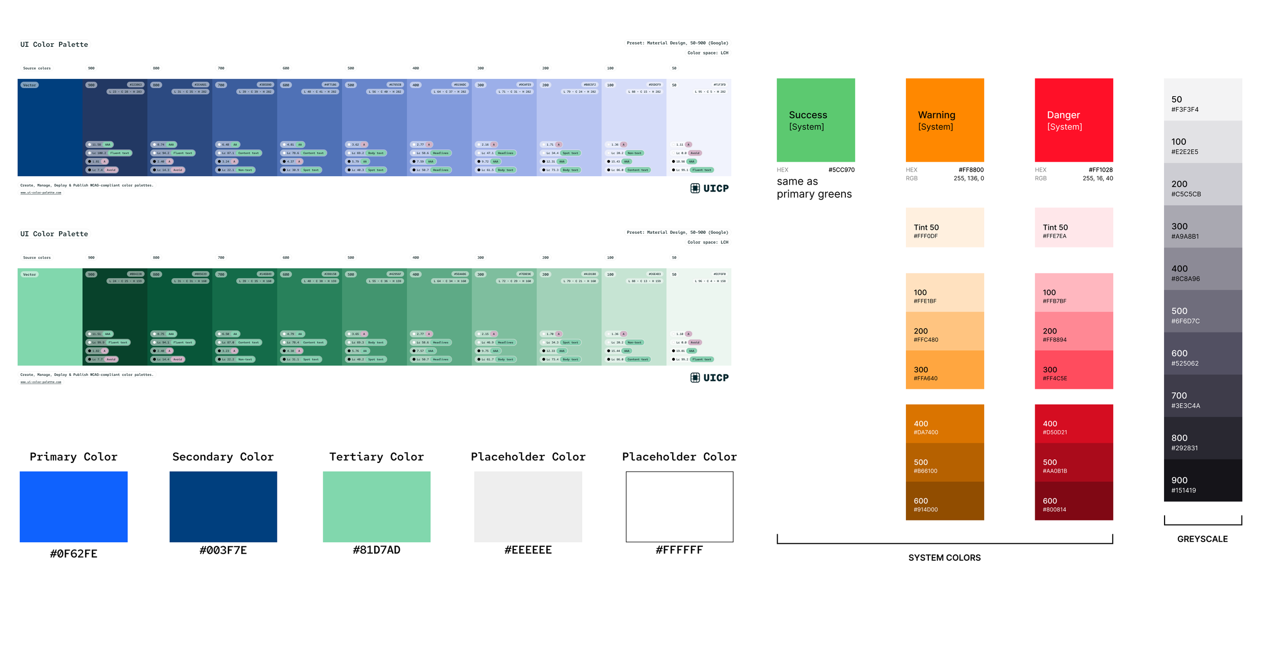
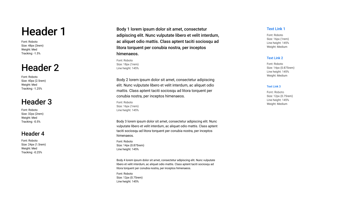
Visual Design Process
My team and I proposed a new set of color palette for the website, logo, and different typography to give the whole website a clean, modern, and professional look. Since green evokes a sense of wellness and is quite associated with health, we decided to incorporate green in our color palette and blue for the standard, neutral look. Below, we revised the color of the logo to be solid and darker, in order to pop out against the white of the website navigation banner.
Logo
Color Palette
Typography
High-Fidelity Wireframes
For the high-fidelity screens, we emphasized consistency across pages and incorporated visuals to break up large sections of text, making information about longevity more digestible. For the Calculator intake form, we used insights from card sorting to group questions into four sections, each on its own page, with a final results page offering users the option to view more or re-calculate. The personal health plan was designed with two versions: a preview of the user’s results and the full version available after subscribing.
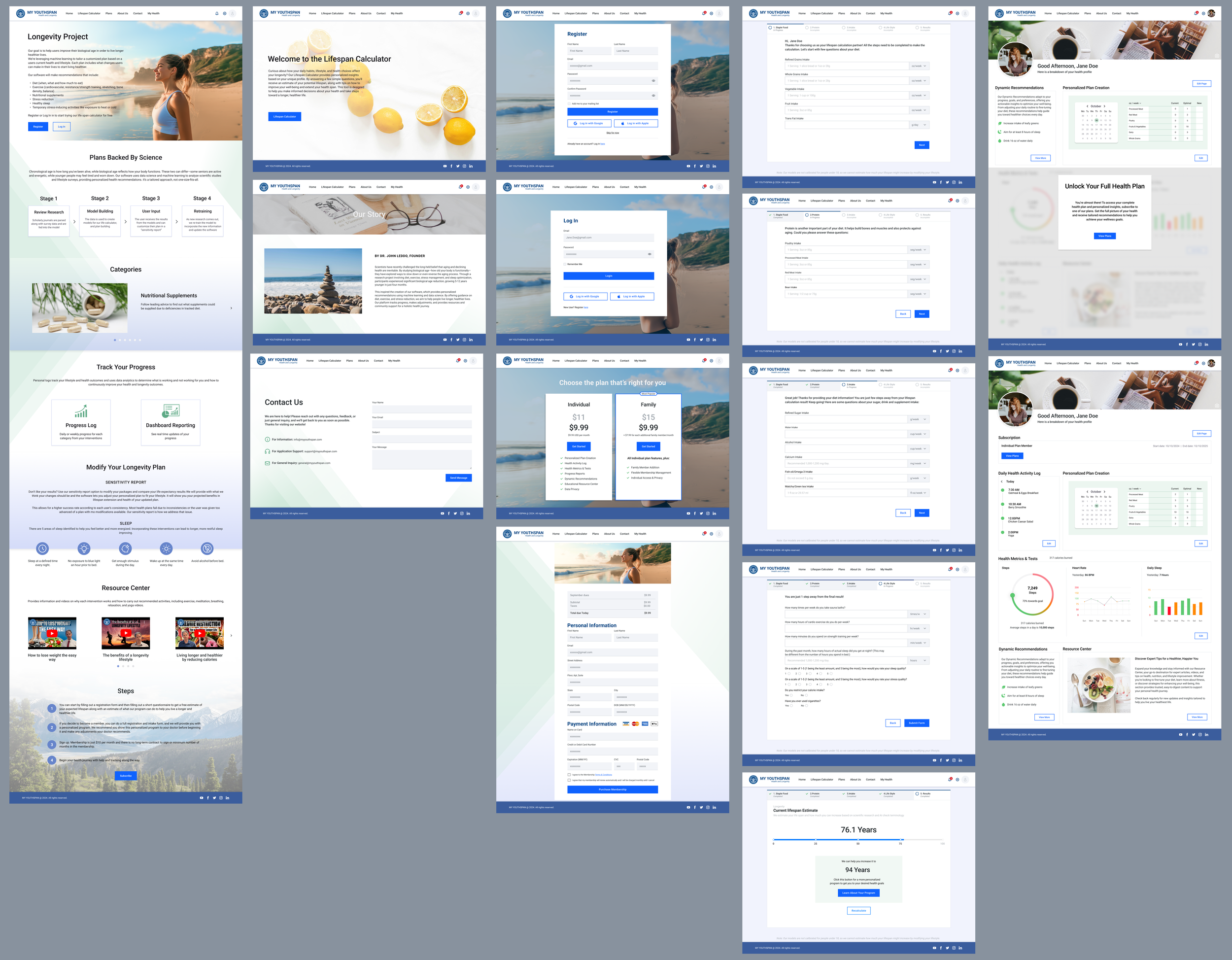
If you would like to view the prototype for the high fidelity screens, click here
Usability Testing
Since this project with the client is more focused on the visual aspects of the website, we wrote out tasks that were more on determining how well the user interface performed while still keeping in mind the importance of the user experience. We interviewed 5 participants in total with only one round as there was limited time for this project.
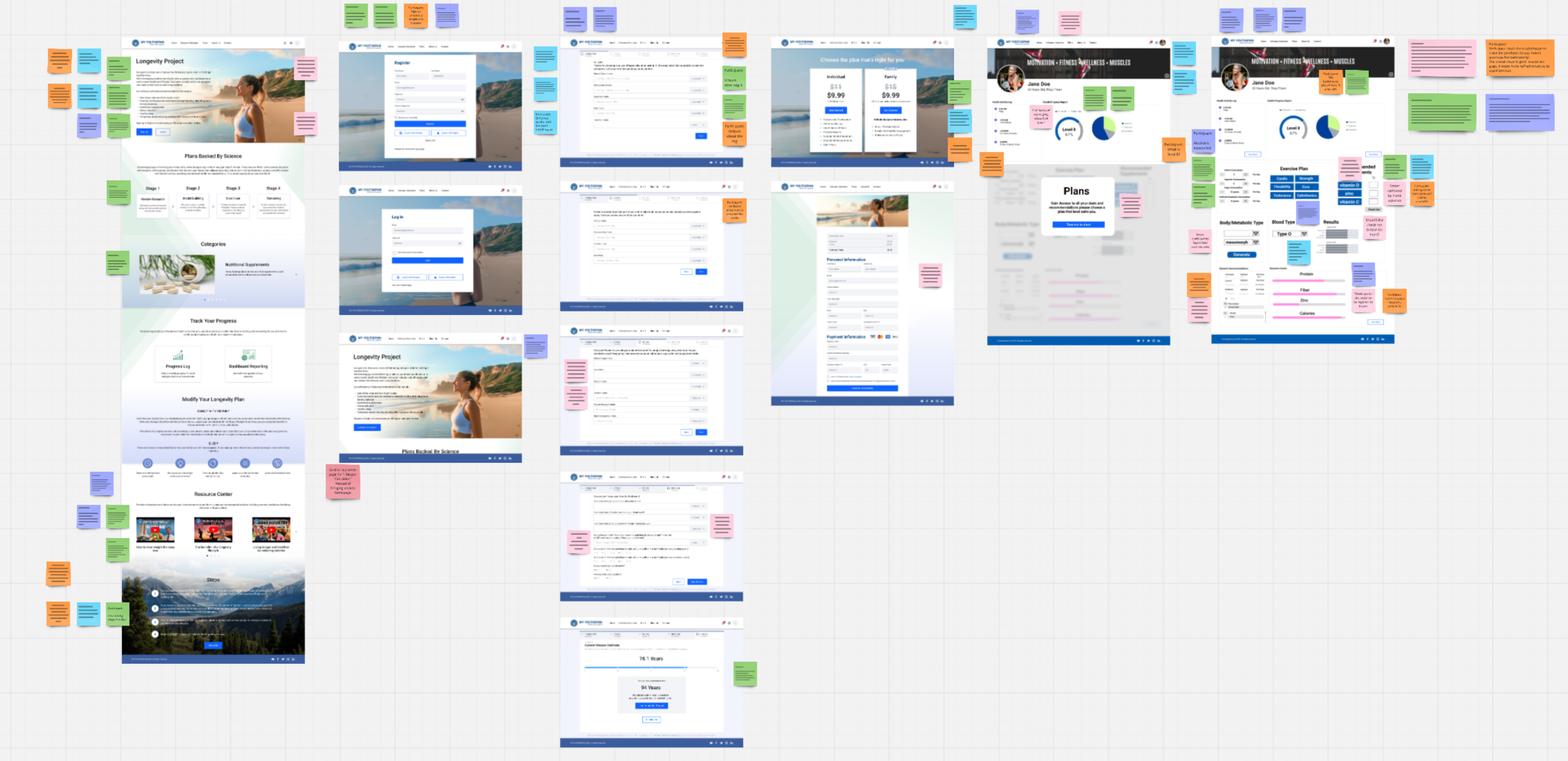
With one round of testing and putting down notes next to each of the screens with feedback, these are some key insights for the prototype:
Homepage:
Clean, modern look and feel
Love seeing visual images alongside bullet points and charts
Participants would love to see more detailed recommendations and bolded words
Register | Log In | Subscription Plans:
Register process was simple and easy to go through
Fast, standard, only one step to get signed in
Plans are easy to understand and compare
One participant stated they wanted to have a free trial option
Intake Form:
Simple, clean layout, pretty straightforward
Some of the metrics were hard to calculate and visualize
Unsure how to calculate the intake for some of the questions
Keep some of the metric tabs consistent throughout all the forms
Personal Health Plan:
Unsure about buying recommended supplements on this page
Participants unclear and don’t understand why they still have to input information on this page
The page overall can be more consistent
Suggestion from the client:
Specifically switching out the bean intake question with fish instead
Conclusion
Overall, the project with the team and the client was a great experience, as the client and my team got to learn new things from one another. The client also mentioned that it would be great if we had more time to work on a mobile version later on. While this was only a month long project with the client, they were quite satisfied with our work and stated they would want to continue on partnering with a team of designers for the future.
Feedback from the client, John Leddo:
"The team was outstanding. They did a terrific job of evaluating our website for UI/UX and created recommendations and Figma diagrams that were superior to what we had created and what we will be implementing. That's to the team for such a great job."
Next Steps
If given more time or future opportunities to revisit this project, I would like to:
Reiterate on the screens based on the usability testing results
Implement a mobile version for this project
Create a more refined and intuitive personal health plan page
If you would like to view a higher quality of the wireframes on Figma, click here
To view the full case study for this project, click here