Ovio Case Study
UI/UX Design
Introduction
Ovio, a game streaming platform was developed with the ambition of transforming how gamers and streamers connect, offering a seamless experience across free and premium subscription models. I received the project brief to design a user-centered, accessible platform that empowers both viewers and aspiring streamers. The design was completed and delivered in a development-ready format, contributing to increased user adoption by catering to diverse user needs.
My Role
As the UI/UX designer, my role is to conduct thorough research and eventually usability testing later on to understand user needs and pain points regarding free versus paid subscription content as well as how well the user interface performs. I am responsible for developing the platform's high-fidelity prototype and design from start to finish, ensuring that the user experience is seamless and aligns with business goals. Through iterative testing and feedback from the usability testing, I am able to refine the design to meet user expectations and drive engagement with the platform.
Tools & Programs Used:
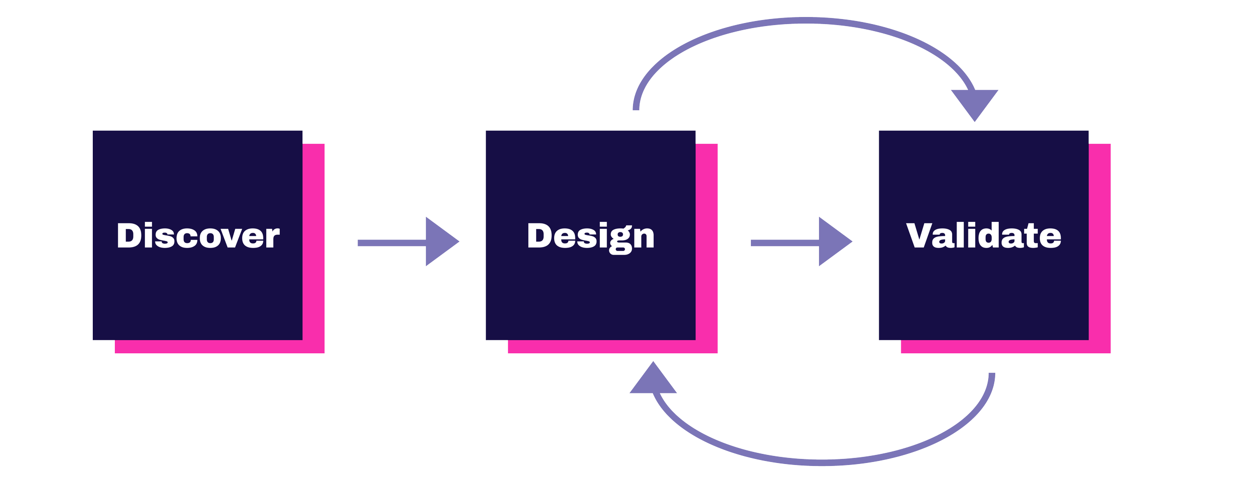
Design Process:
Objective
The objective of this project was to design a user-centered game streaming platform that seamlessly transitions users from free accounts to premium subscriptions. To achieve this, I conducted Secondary Research, Heuristic Analysis, a Survey Questionnaire to understand user needs, identify areas for improvement, and validate design decisions. These methods were chosen to ensure an intuitive and engaging experience that appeals to both new and existing users while driving more premium subscriptions and supporting the platform's growth.
Key Findings from the Survey Questionnaire:
⭐71% of participants watch streams daily and weekly
⭐All participants primarily use their desktop/laptop to watch streams, with more than 50% watching from their mobile phone as well
⭐Around 61% of participants have paid subscription to mainly Twitch, but some opt for YouTube for specific streamers
⭐The biggest reasons that users do not have a paid subscription are:
Not enough value: 47%
Prefer free content: 57%
Not interested in exclusive perks: 57%
⭐Users value high-quality streams and a variety of content the most
⭐Most favorite and annoying features on any game related platforms:
Most favorite: Chat function, custom perks, interactive & efficient functionality feature
Most annoying: Ads
⭐Users typically like to interact with these streams by just simply watching them, or following/unfollowing streamers
⭐47% of users have never paid for a subscription plan on these platforms, and with 23% having been subscribed for 1-6 months, and another 23% for a few years
⭐Feature that users would like to see improved or added in: Less Ads, more option to discover other non-popular streamers
⭐66% of users would be encouraged to upgrade to premium if it was a lower cost
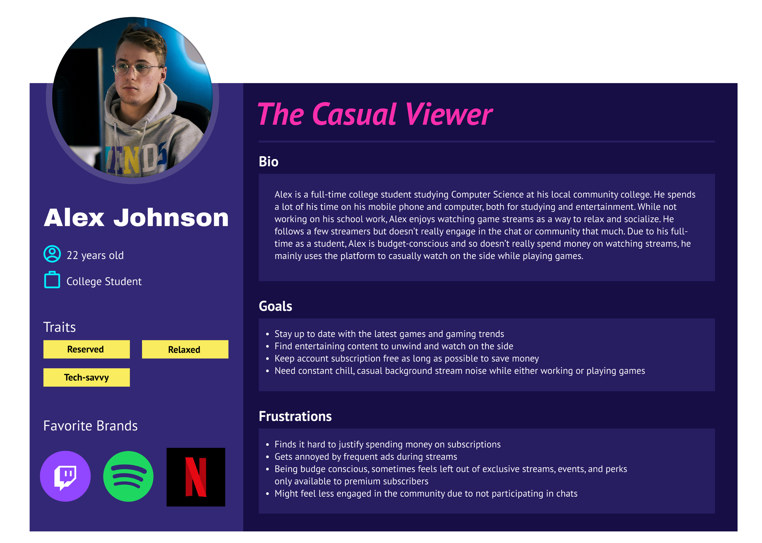
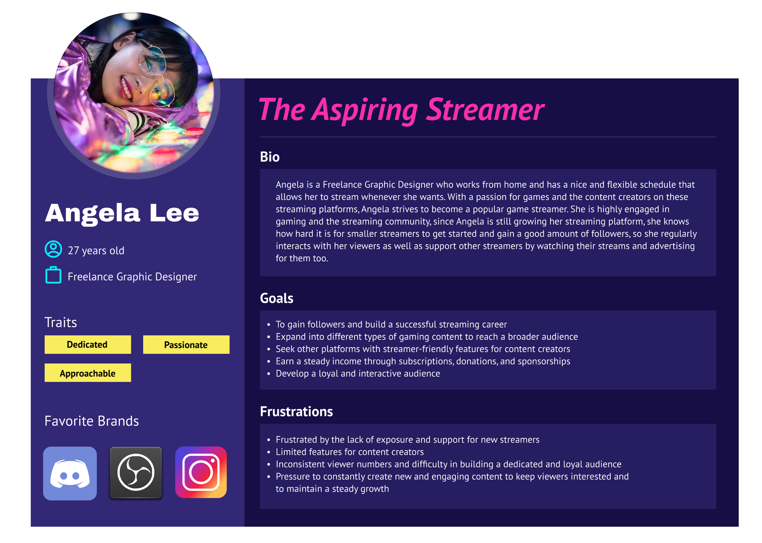
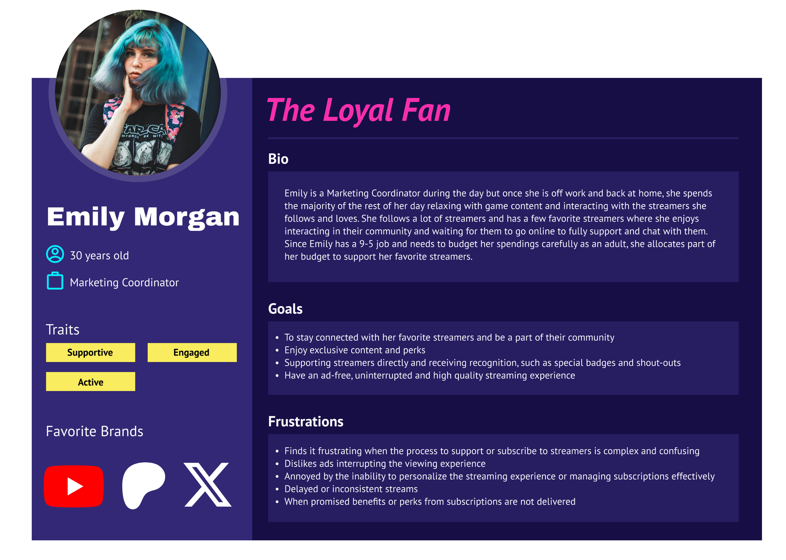
Personas
User Flow
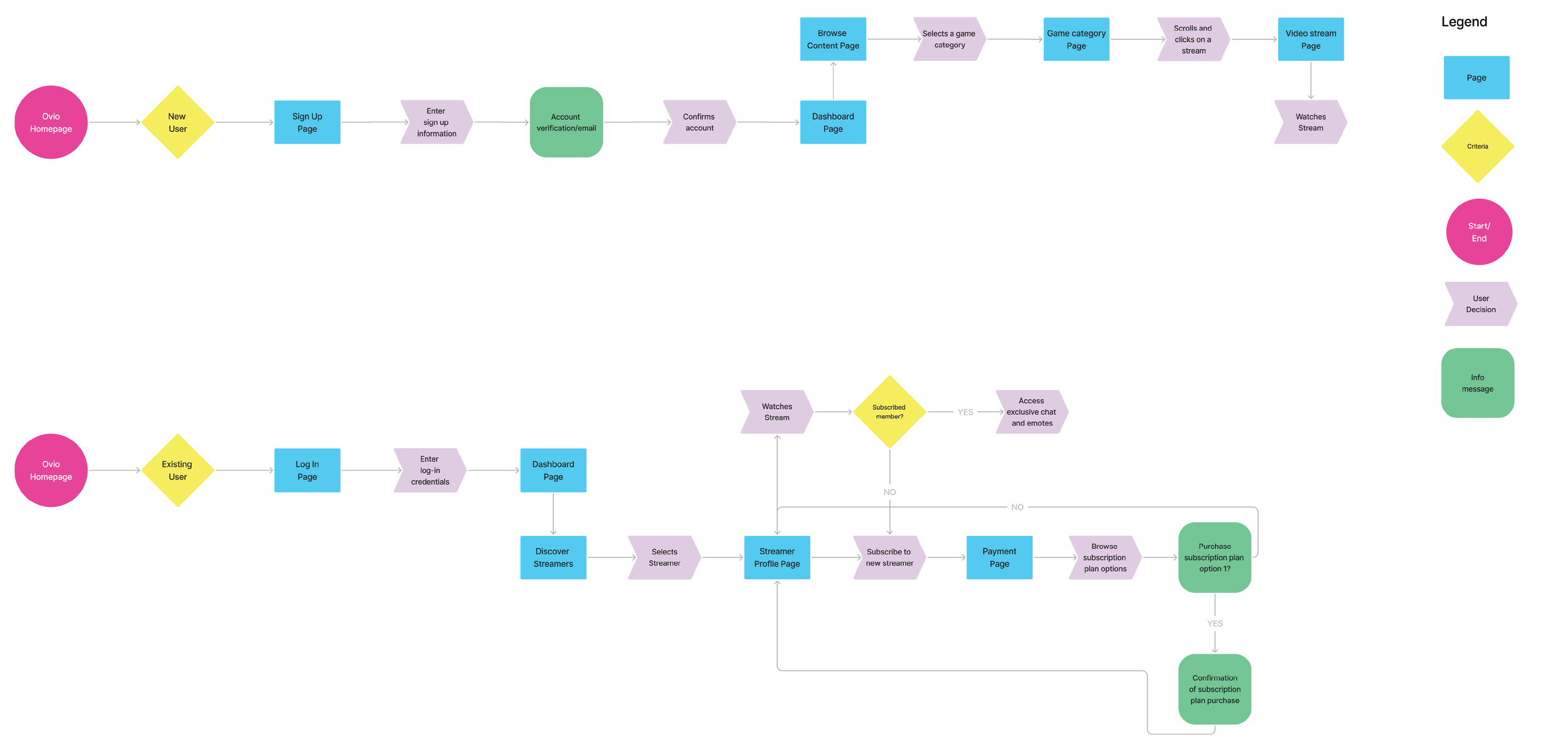
I created a user flow map to visually represent the steps the users take while navigating the game streaming platform. By creating this map, I can identify the key interactions and decision points, which can then ensure a smooth and intuitive user experience from start to finish. By outlining the paths that both new and returning users follow, this user flow map brings up potential pain points and areas for improvement which can result in a polished and seamless platform.
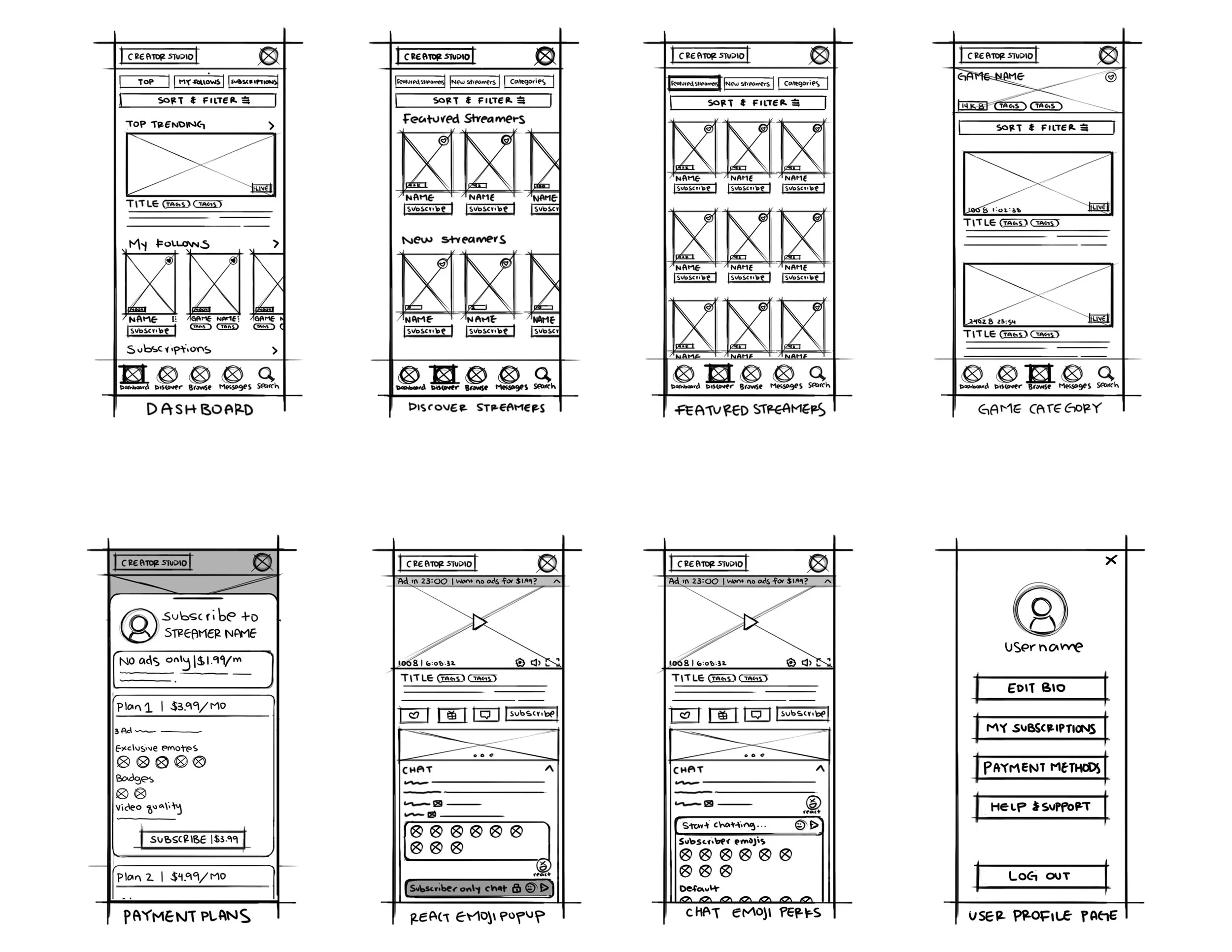
Sketches
To start off with the first and the foundation phase of the design process, I sketched out the key screens which can allow me to explore the ideas and concepts of this project. Conducting this stage was crucial for a brainstorming session into the different approaches to the user interface and the most intuitive design elements before committing to the digital tools. Here are some of the key screen sketches:
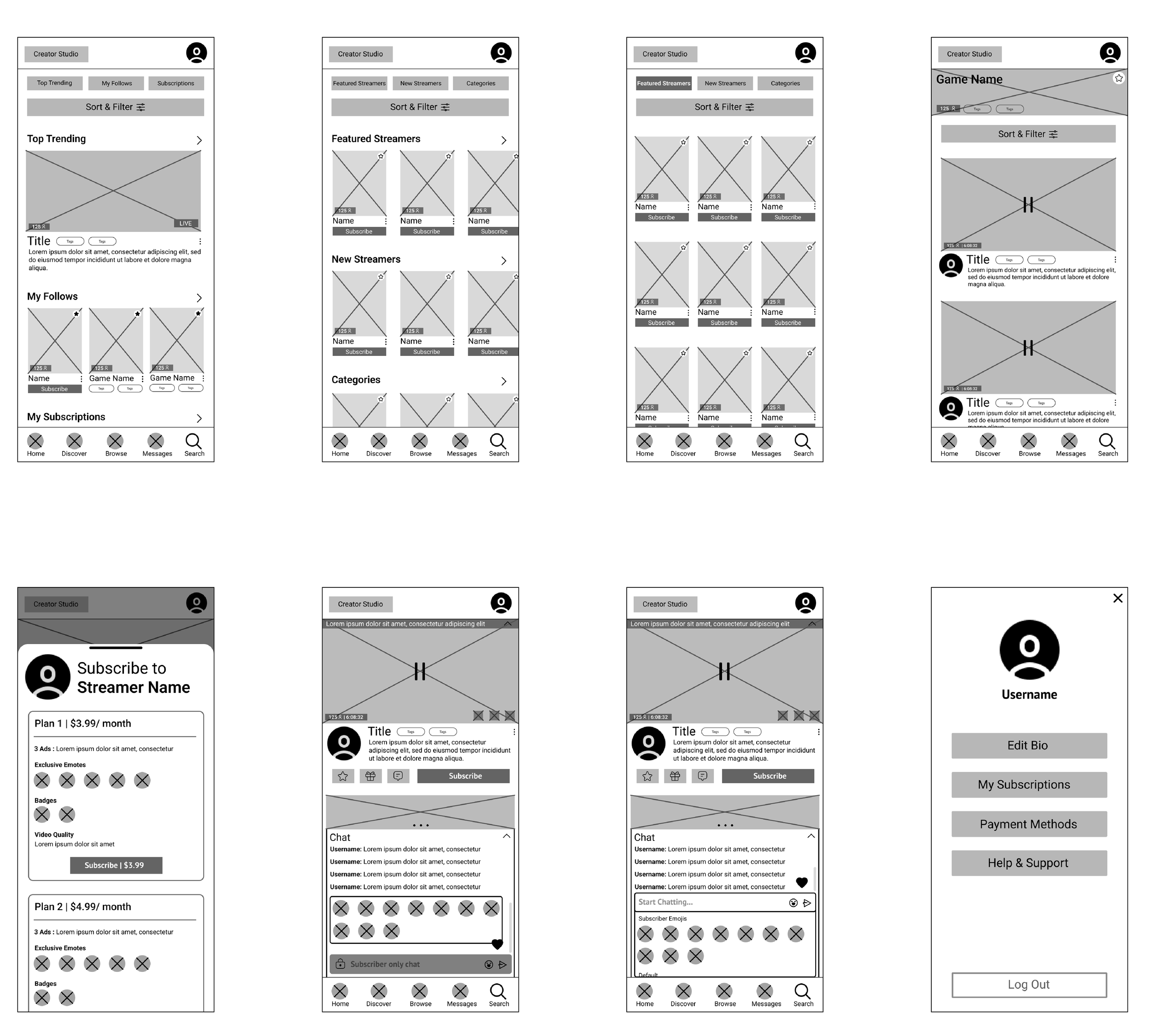
Low-Fidelity Wireframes
I then transformed the initial sketches into a more detailed digital layouts. These low-fidelity wireframes were essential in mapping out the core functions of the platform, such as the navigation system, content layout, and user interaction.
Usability Testing
Testing these wireframes would help me gather what major issues there are and revise my designs based on the feedback in order to improve the user experience and interface. I gathered up 5 participants for both testing sessions and conducted a remote, moderated test. The 5 participants for both rounds were given a clickable prototype and these are the objectives that I have in mind when conducting both first and second round of testing:
Gather up insights on the user experience of my game streaming platform, with a particular focus on the interface and the distinction between free and paid content
Understand how users interact with the platform, identify any pain points, and improve overall usability
questions asked during the testing sessions:
Imagine you have some free time and want to relax by watching a stream of your favorite game. Can you find a stream that interests you on the "Browse" section?
-How do you typically find new content to watch on streaming platforms?
-What did you think about the way content is categorized and presented?
You’ve found a streamer you really enjoy and want to support them by subscribing to their channel. Can you go through the process of subscribing to this streamer?
-What aspects of the subscription process did you find intuitive, and which parts did you find confusing?
-Were the benefits of subscribing clearly communicated?
You want to find new streamers to watch that are not as known and support them since your favorite streamers aren’t online at the moment to stream. Can you navigate to find upcoming, new streamers and sort out the results based on views?
-As you searched for new streamers, were there any features or options that you found particularly helpful or confusing?
You just paid and subscribed to a new streamer and started watching their content and want to start engaging with them and other viewers. Can you navigate to your new streamer that you just subscribed to and start chatting with them?
-How did you feel about the overall process of finding and starting to chat with the new streamer?
You are interested in reducing the number of ads you see while watching streams. Can you find information about the available subscription plans that offer fewer ads?
-Can you describe your experience looking for information about subscription plans that reduce ads?
First Round Testing Results
And based on the results of the testing, I categorized the common errors and issues into three categories: Critical, Major, and Minor.
Terms such as “New” and “Date” were unclear
There was a need for “Ascending/Descending” option for the filters
Some participants did not use the “Discover” tab located at the bottom at all
Solution:
Rename or remove the terms listed on the filter function and add in an “Ascending/Descending” option in filters
Rename the “Discover” term on the bottom navigation bar
Participants liked to use the search bar to find content & filter out options
The “No Ads” banner was not noticed by a couple of participants
Barely any differences between the subscription plan details and no additional info anywhere
Solution:
Add in a search bar to the filter function
Specify and put in more details & differences for the subscription plans
Include a “No Ad” banner with stark contrast to draw attention
Participants were confused on some of the terms used, “Category” and “New Card+”
Too many clicks to get to the main stream content
No subscribe button for “No Ads” plan
Solution:
Replace the terms
Reduce the number of clicks to get to the stream content
Add in a subscribe button for the “No Ads” plan
Visual Design Process
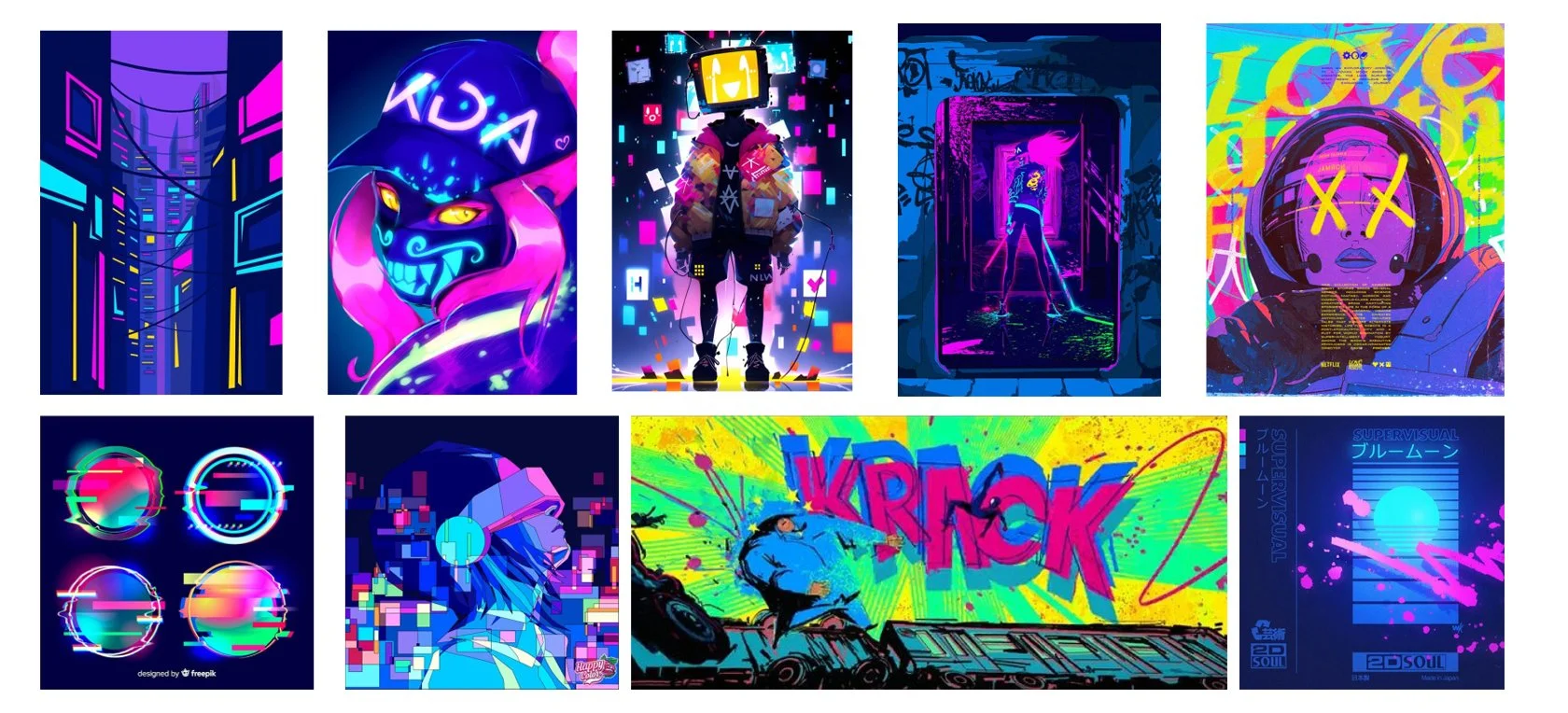
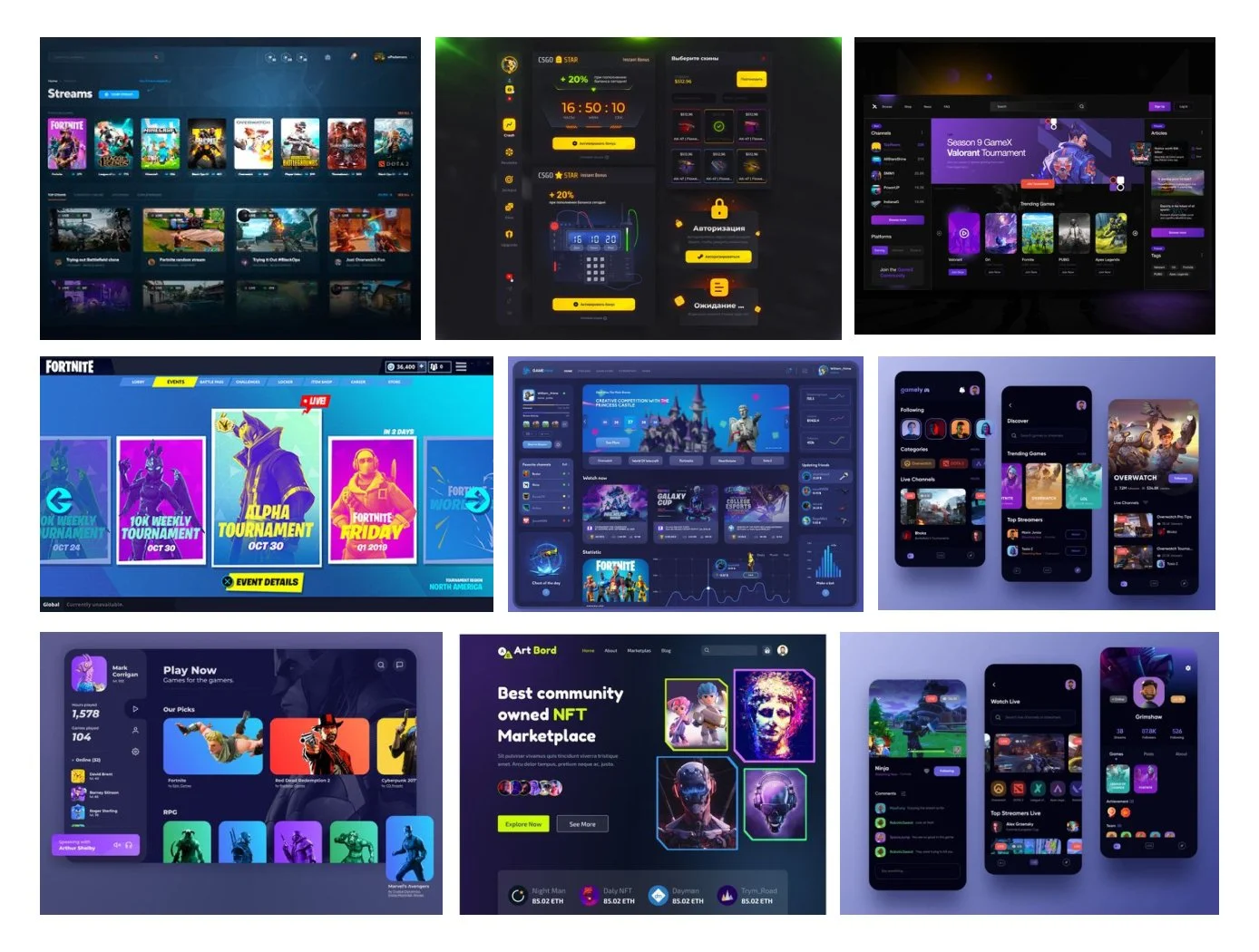
Ovio is a game streaming platform designed to offer a seamless and immersive experience for both the casual, loyal, and the aspiring streamers. This visual design process focuses on creating an intuitive, bold, visually appealing interface that enhances user engagement while trying to support the idea and transition from free to paid content.
Brand Personality:
Ovio is described as uniquely diverse, but somehow always familiar. This creates the need for design to balance that tension.
Brand Attributes:
Bold, Smart, Hip
Mood Board
Image Inspiration
UI Inspiration
Style Guide
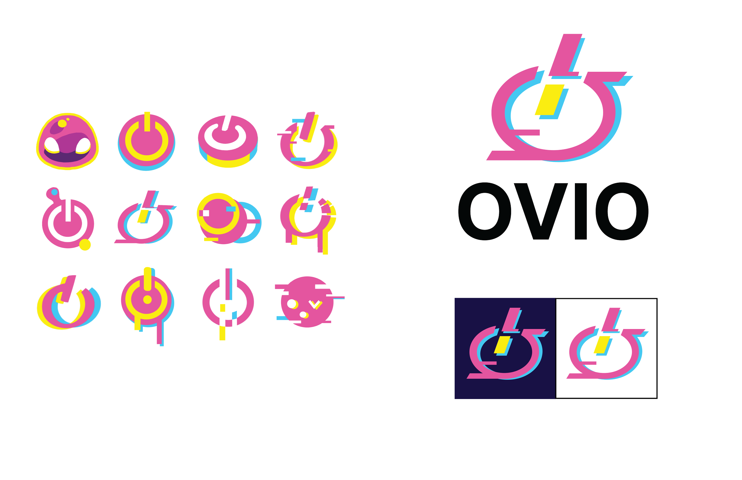
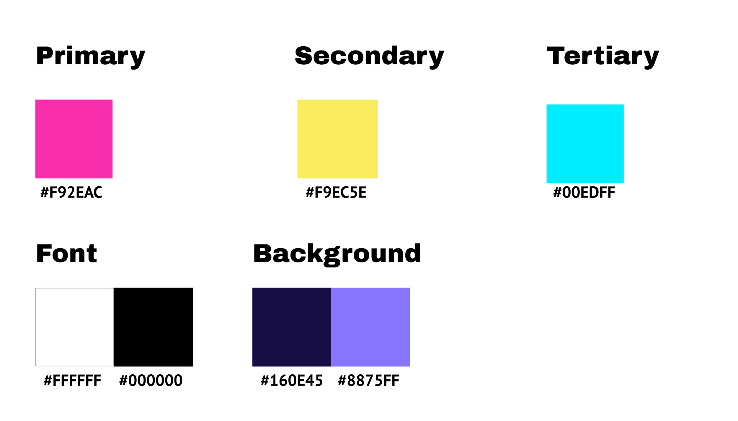
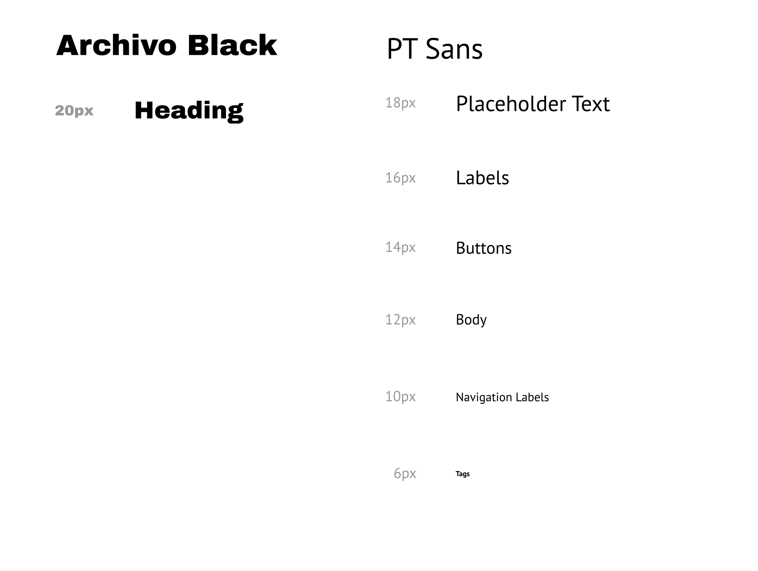
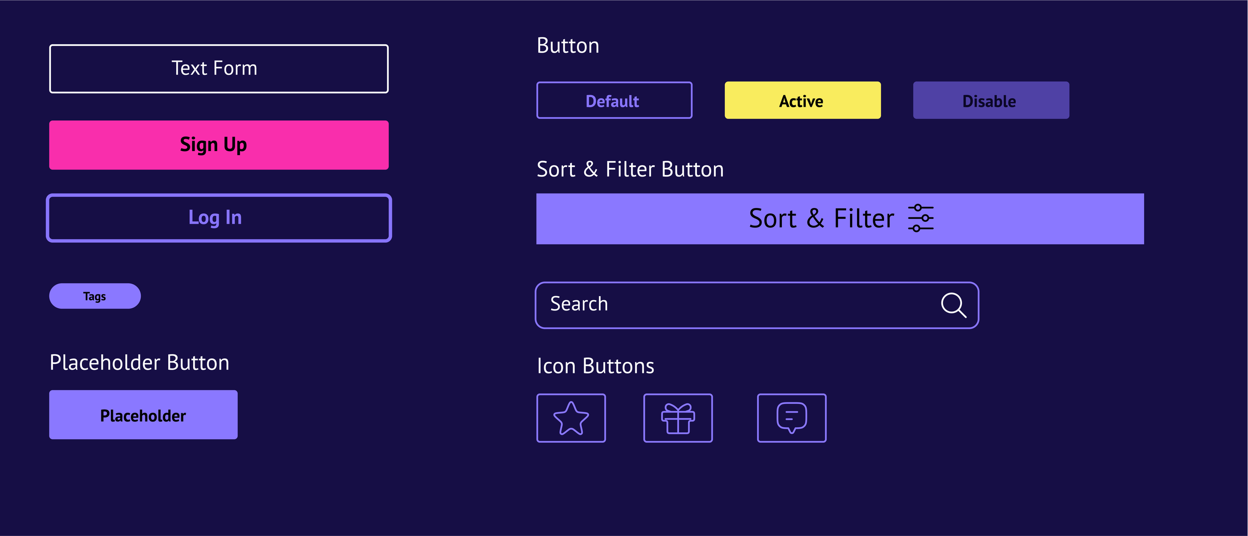
The style guide for Ovio was designed to create a consistent and unified look across the platform. It features a vibrant color palette of yellow, pink, and blue, capturing the energy of gaming culture and the bold and hip attributes of the brand. Typography is modern and easy to read, supporting a clear and engaging user experience. The icons and UI elements are clean and straightforward, ensuring the interface is both intuitive and user-friendly. This guide is essential for maintaining a cohesive brand identity throughout the Ovio platform.
Logo
Color Palette
Typography
UI Elements
Iconography
High-Fidelity Screens
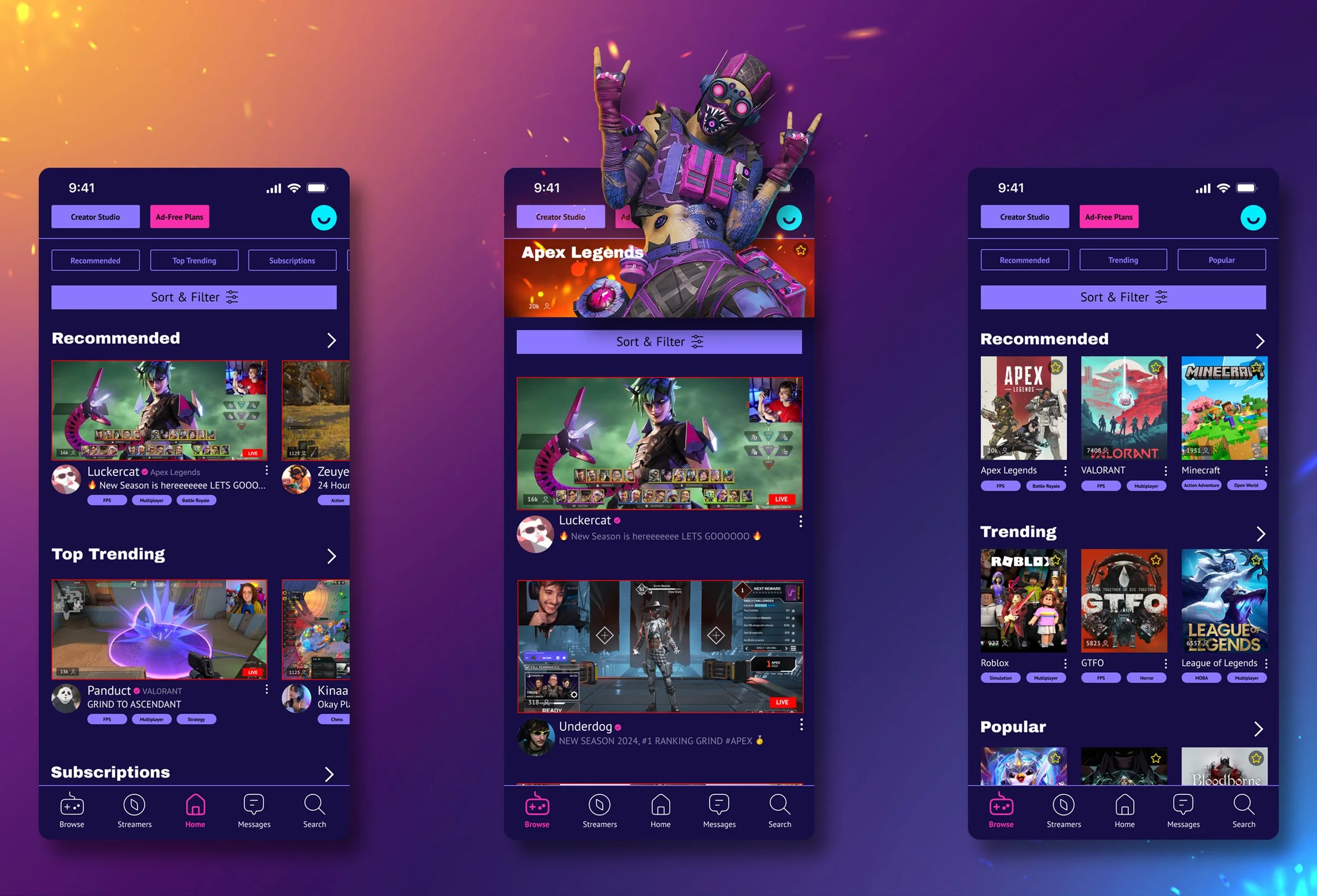
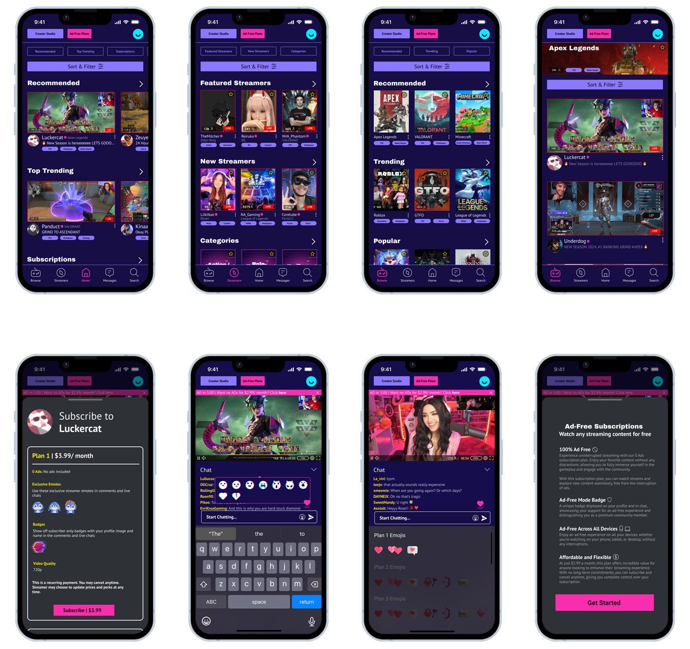
After finalizing up my mood board and the visual design guide, I set out to create the high-fidelity design stage. This phase involves refining my low-fidelity wireframes into a complete visual representation of the final product, incorporating the branding, color schemes, typography, and any interactive elements. The high-fidelity prototypes were used to simulate the real user experience. These are a few examples of the high-fidelity screens:
If you would like to view the prototype for the high fidelity screens, click here
Second Round Testing Results
No other information for ad reduction. Participants noted they would go to their profile page or re-click the subscribe button to get more information on ad reductions. They assumed the information would be under “Help & Support” in their profile page
Solution:
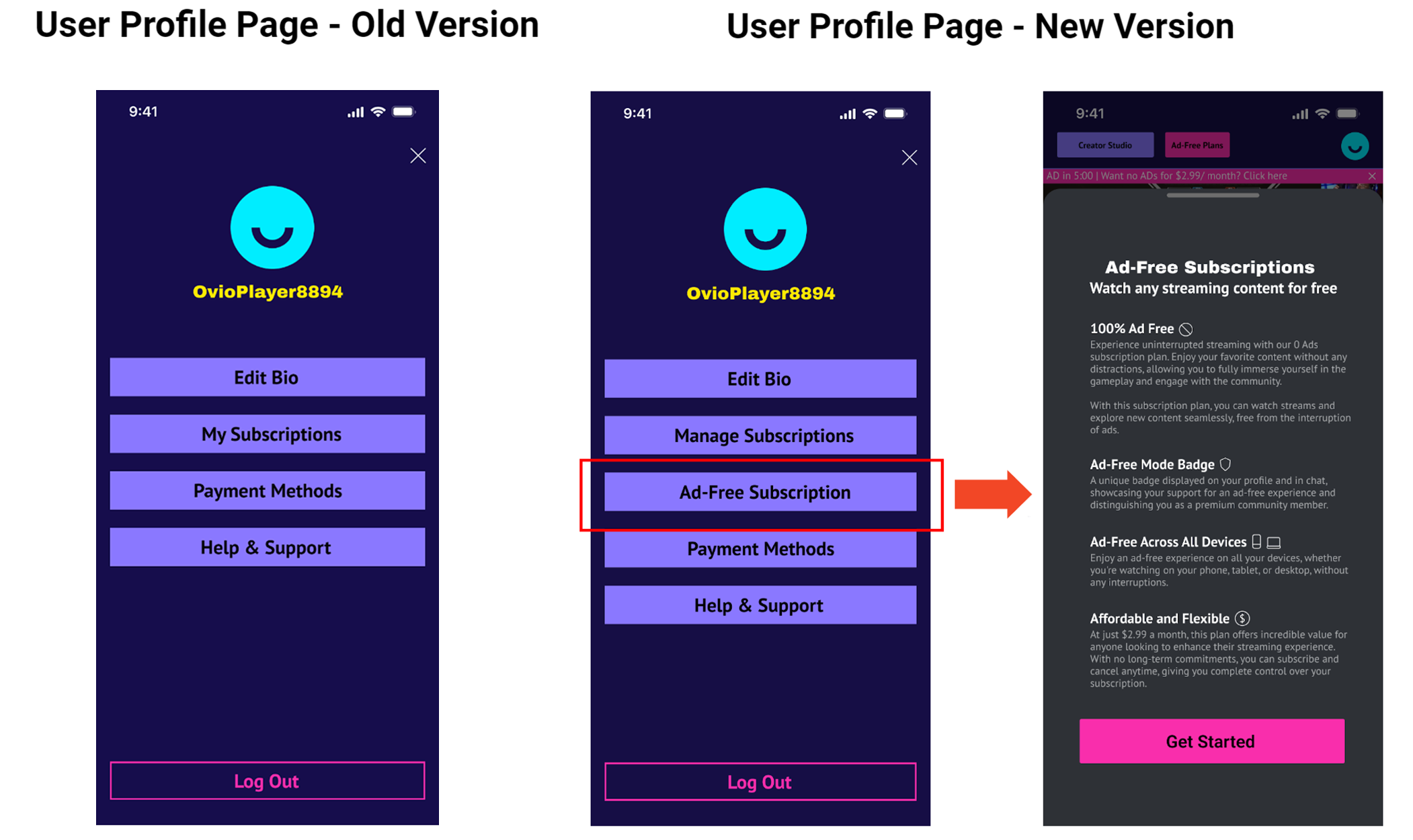
Keep the ad banner on the stream video & add in the ad reduction plan page in the user profile section
Participants noted it takes multiple clicks to get to the stream content from the homepage. They noted that if users open the app and don’t find the content they want on the homepage, they wouldn’t bother with the rest of the navigation tabs and other pages as it can decrease user retention
Solution:
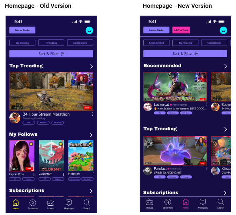
Prioritize the “Recommended” portion of the content. Add in more recommended stream video thumbnails on the homepage and have it easily accessible to click and navigate to immediately
Contrast Issues on the navigation bar on the bottom
Not immediately obvious what “Trending” vs “Popular” is or “My Follow” vs “Subscriptions”
Participants did not notice the chat function disabled if they aren’t subscribed
Solution:
Alter the contrast of the navigation bar
Rename the “Popular” term. Add in “Recommended” instead. “My Follow” to “My Likes”
Gray out or lower the opacity for the chat function if users are not subscribed yet
Based on the issues that the participants from the second round experienced, here are some of the fixes based on the feedback:
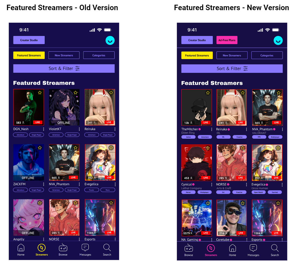
Some of the contents on the homepage has been revised and altered from the first pass. Recommended content is being prioritized more now because many participants have stated they rely on the recommended section quite a lot when browsing around for content to watch on streaming platforms.
When users click on the Ad-Free Plans button located at the top of the interface, they are brought to a detailed page describing the perks of going ad-free, which they can proceed to a free trial before committing.
Clicking on the newly added “Ad-Free Subscription” button, they are brought to a new page that lists out the details of the Ad-Free Subscription plan.
Streamers on the platform are now listed with online being first and in the front, compared to before where online and offline streamers appear in random order. This way, live streamers have the current content that’s available for users to view much faster and their profile can be easily clicked to bring users straight to the stream page. Users won’t have to sift through a page full of online and offline streamers, trying to look for current live content that’s available.
Conclusion
The development of Ovio from start to finish has been an insightful and challenging journey, from understanding user needs and the current market trends to designing and testing a platform that balances functionality with user experience. By writing up a concrete project plan as the first step before diving into the rest of the project, I was able to smoothly proceed through each phase in the timeframe written down without any delays. From conducting thorough research, heuristic analysis, to creating key personas and user testing, this project has been shaped into a product that not only addresses current challenges in retaining users in these game streaming platforms, but also provides a solution for transitioning users from free content to paid subscription plans. Ovio is designed to promote community engagement, support content creators, and offer content to users with options of exclusive features and ad-free options.
Next Steps
Refine the platform even more based on user feedback
Improve the interface and create a more seamless experience with additional usability testing
New and ongoing updates as well as feature expansions are also planned out to keep Ovio competitive and responsive to user needs
Thank you for reading through my capstone study and reading through my journey on creating Ovio from start to finish.
If you would like to read through a detailed case study on Ovio, click here
